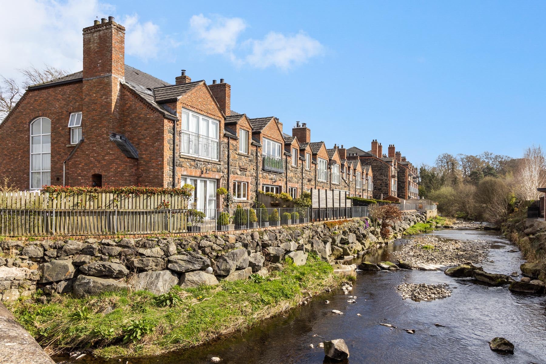
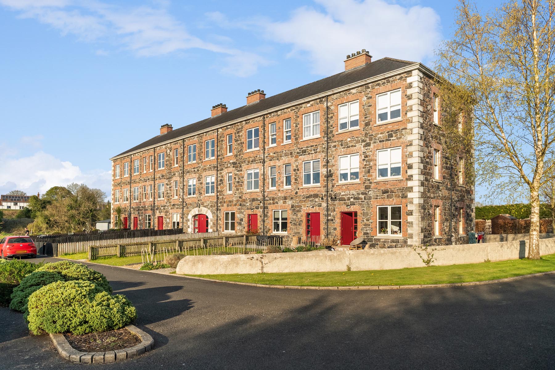
Our brief was to create a distinctive brand identity and website that would reflect this balance – presenting the company as a modern, forward-thinking developer while still connecting with the rural settings where their homes are built.

Our brief was to create a distinctive brand identity and website that would reflect this balance – presenting the company as a modern, forward-thinking developer while still connecting with the rural settings where their homes are built.
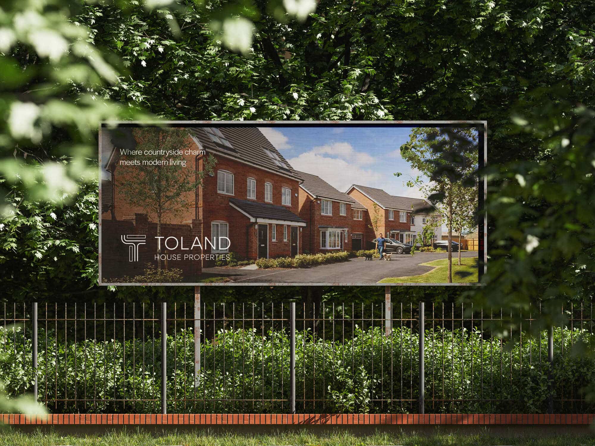
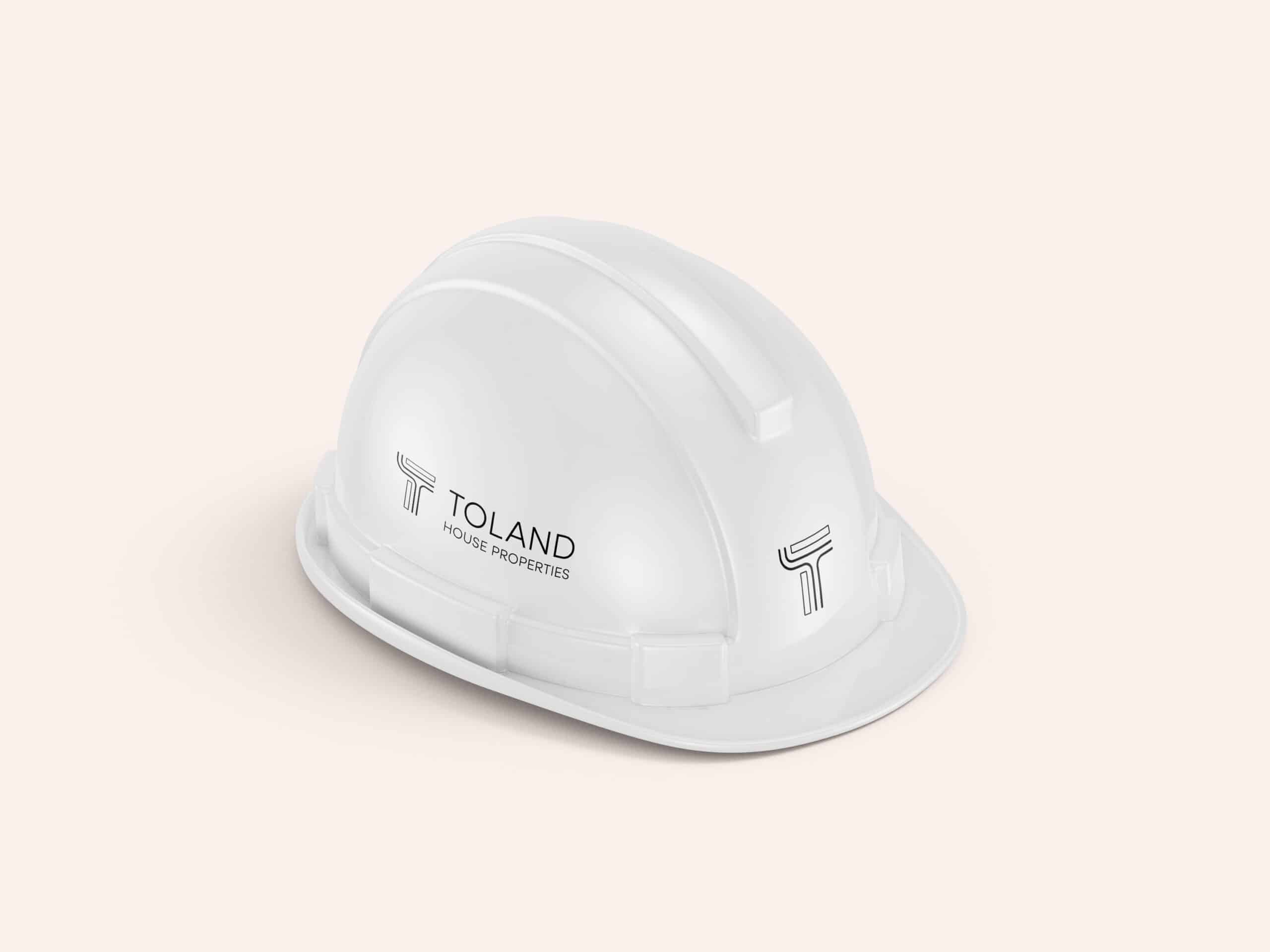
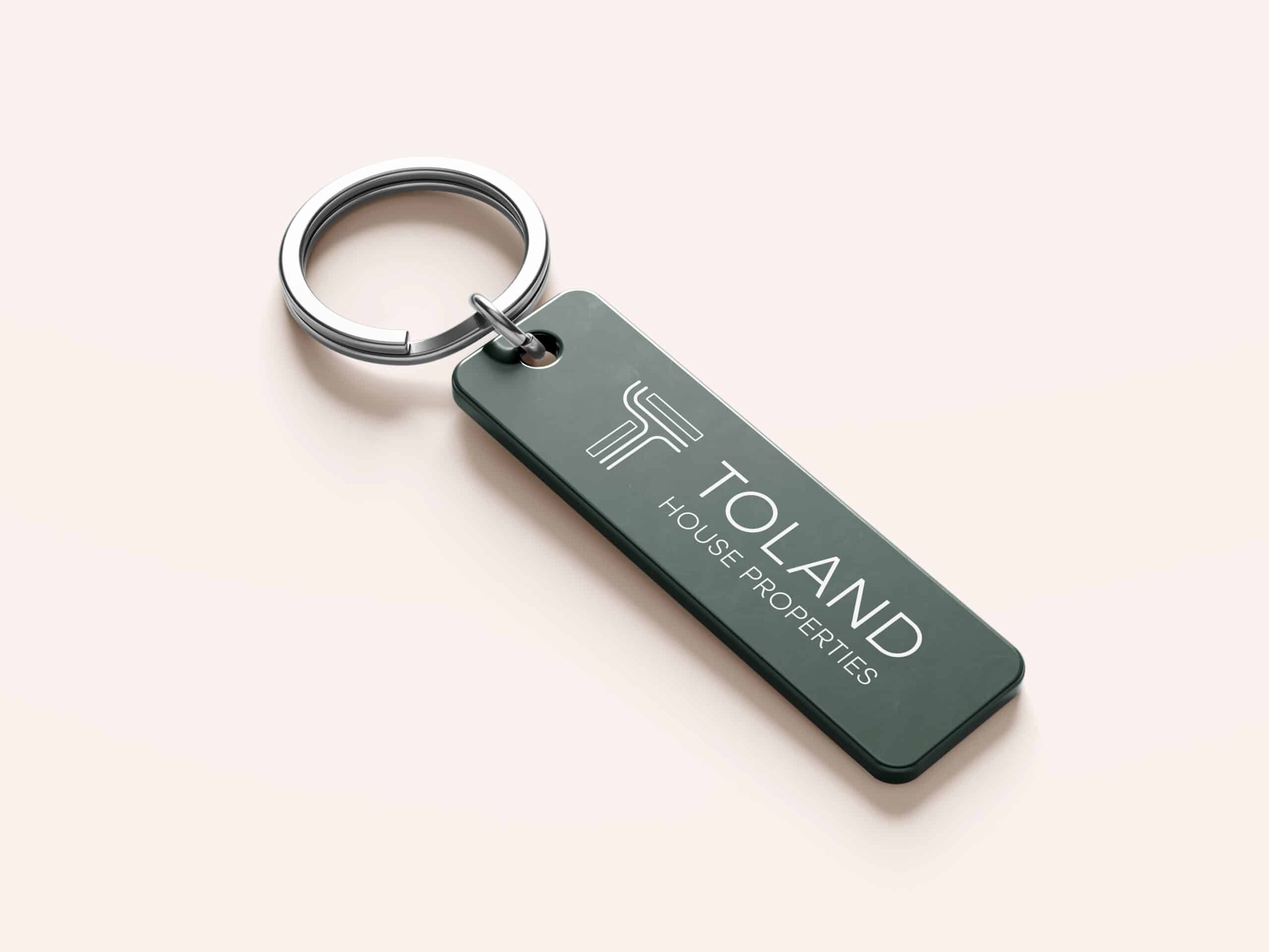
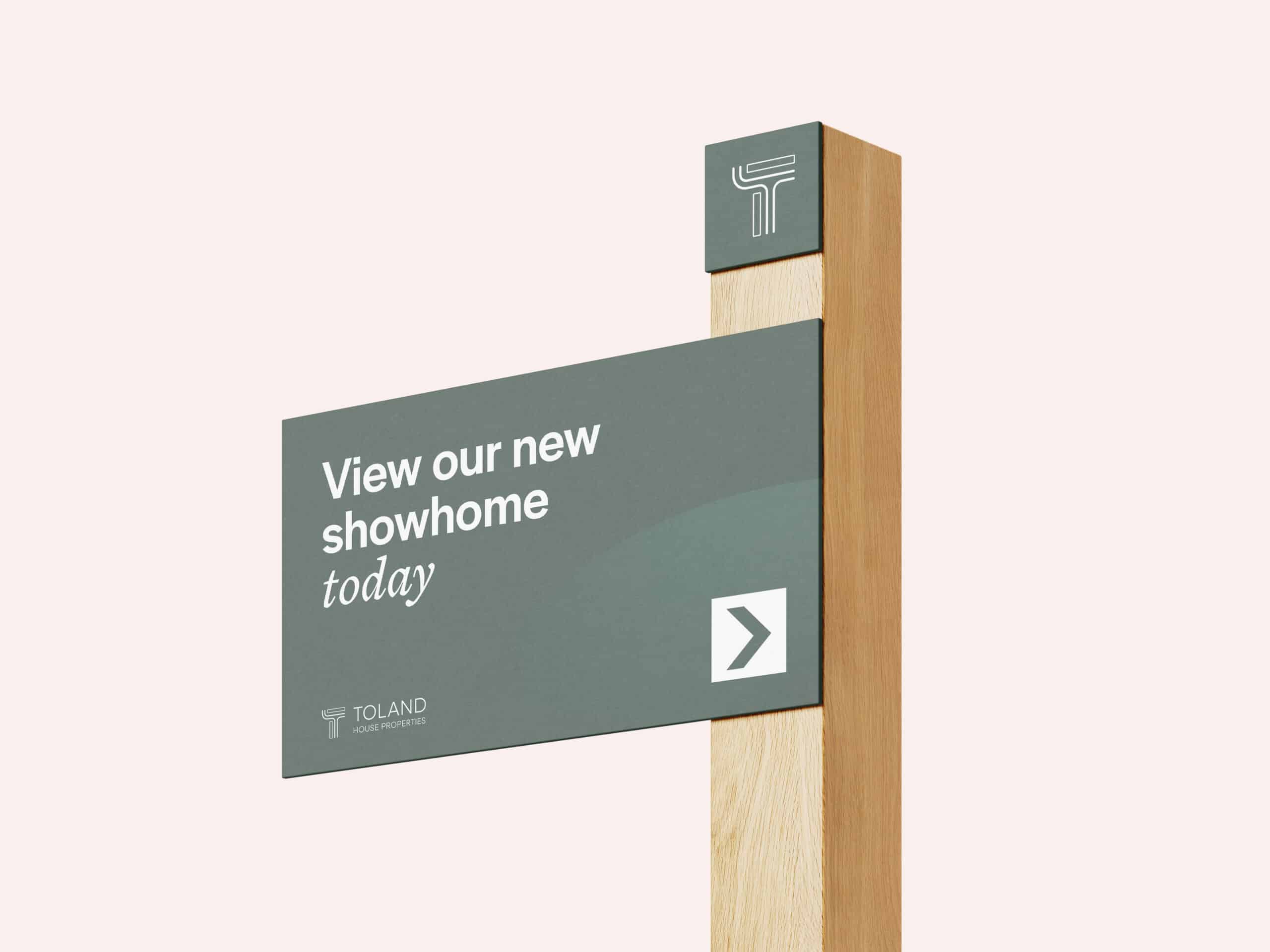
The branding needed to feel clean, recognisable and contemporary, while also subtly referencing the architectural and planning aspects of property development. It also had to work effectively across a wide range of applications, from small-scale uses such as keychains and stationery through to large-scale signage and billboards.
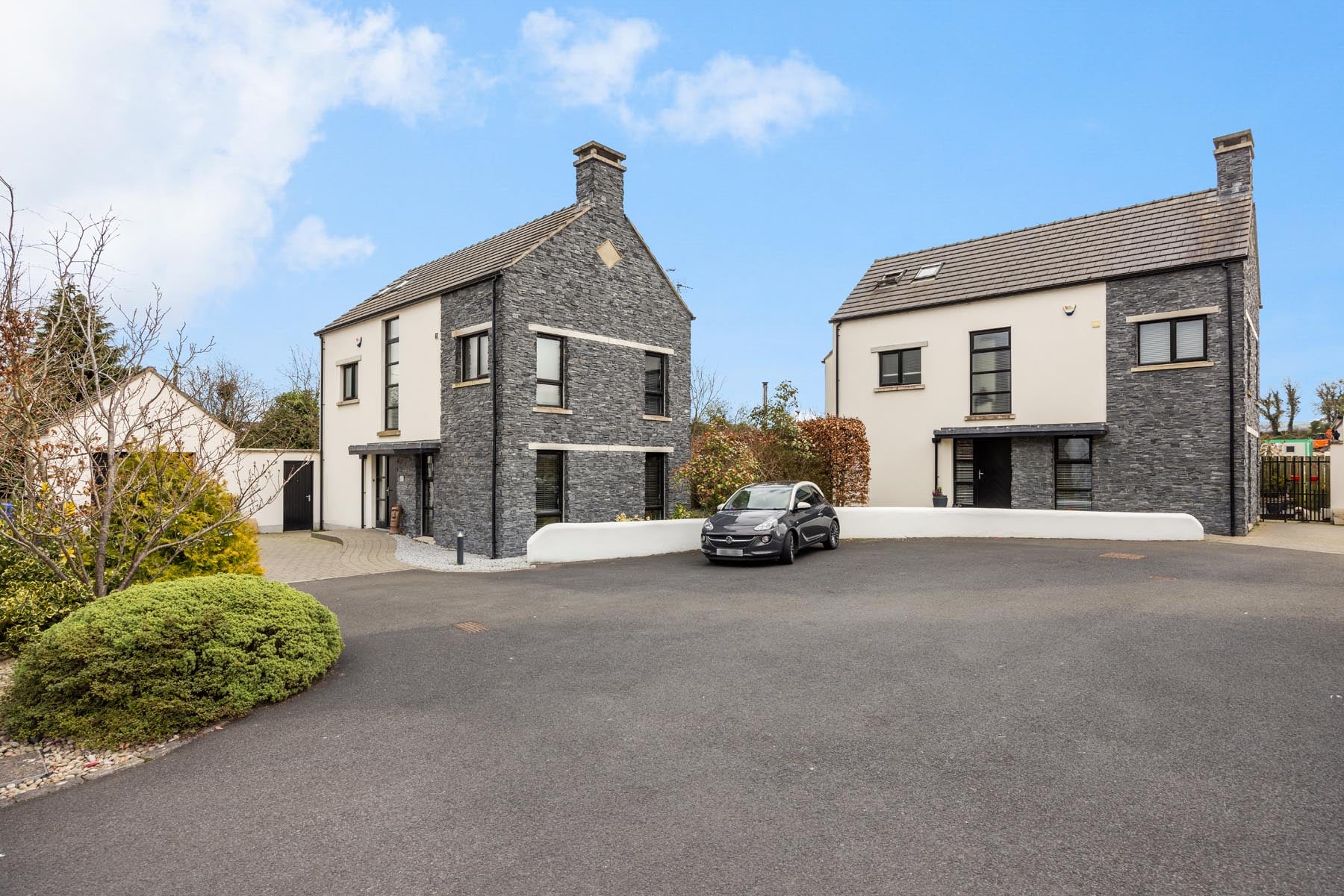
At the same time, the identity needed to communicate the core philosophy behind the homes themselves: developments that blend naturally into countryside environments while offering modern living standards.
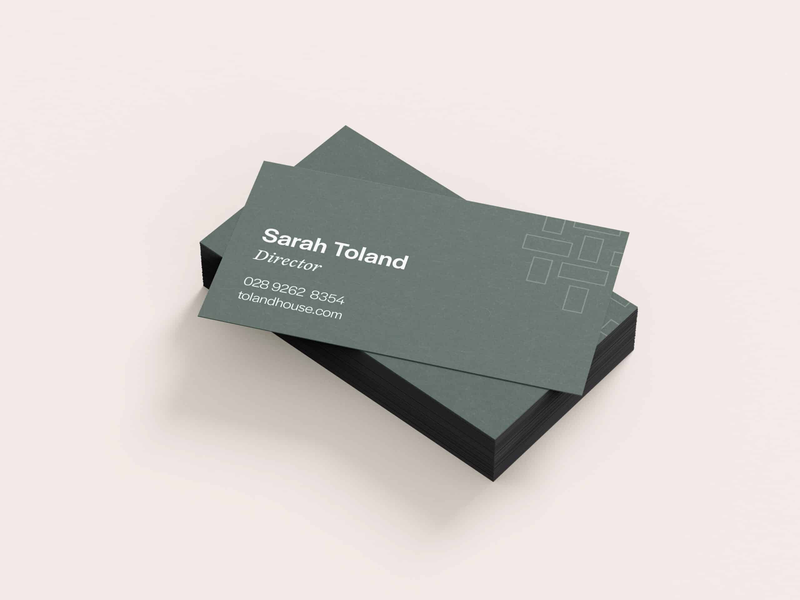
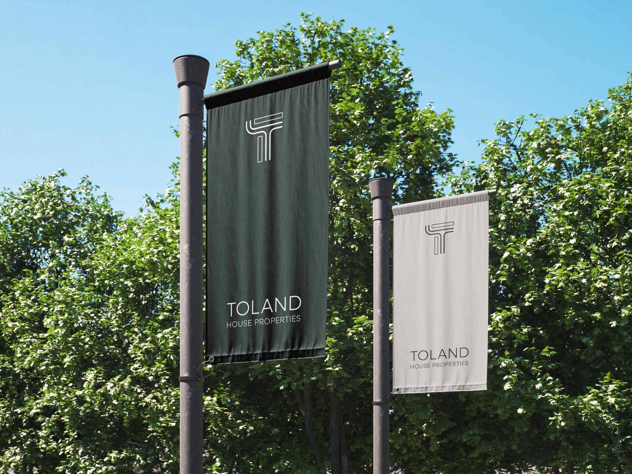
The centrepiece of the brand is a simple but distinctive standalone “T” icon. The mark is constructed using the type of clean, structured lines typically seen on architectural development site plans, subtly referencing the planning and design work behind each project. This approach gives the icon a strong visual connection to the property development process while keeping the overall design minimal and modern.
The icon was designed to function both alongside the full company name and as a standalone symbol, making it versatile across digital platforms, signage and branded materials – as well as being the basis for a effective background pattern.
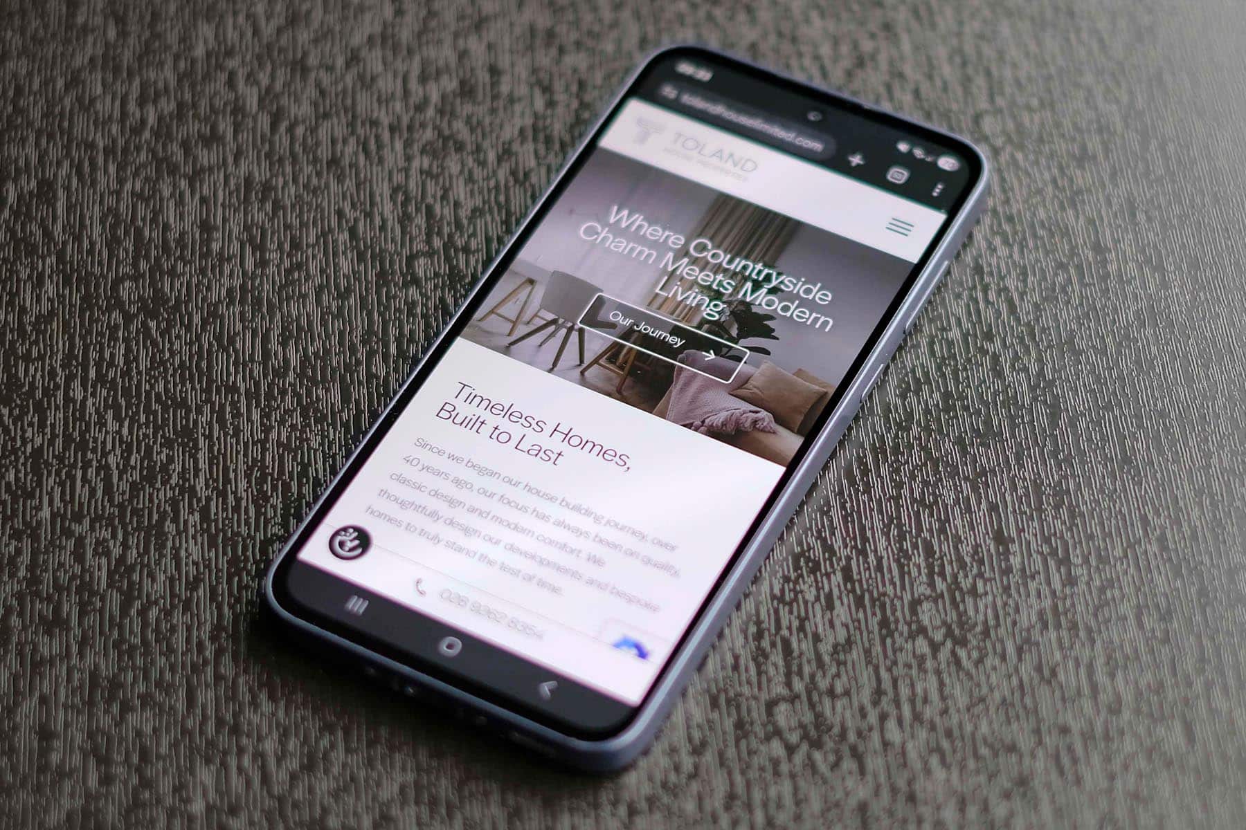
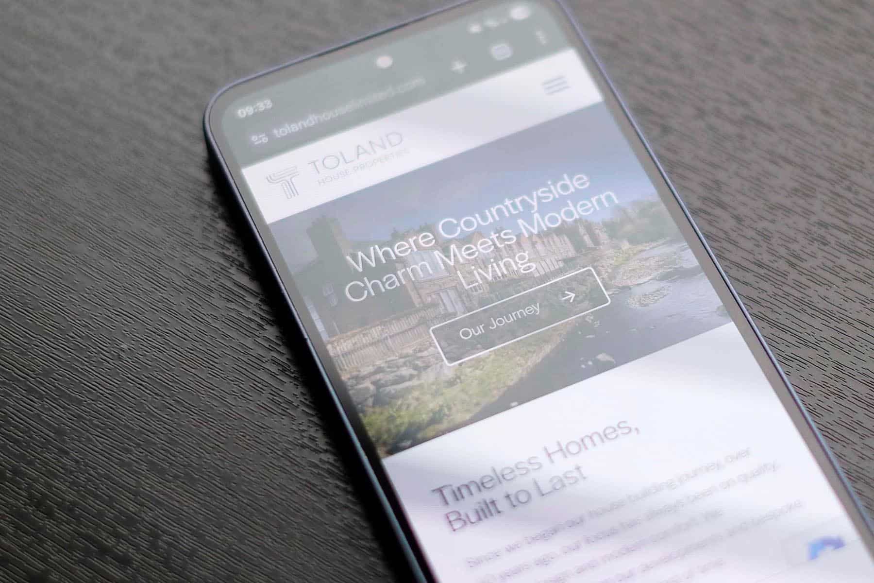
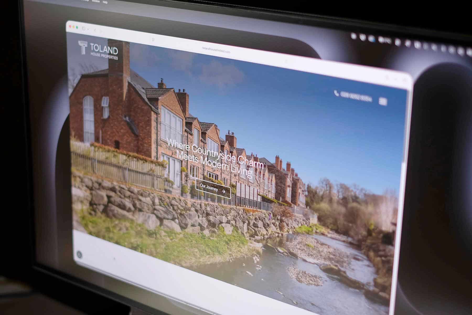
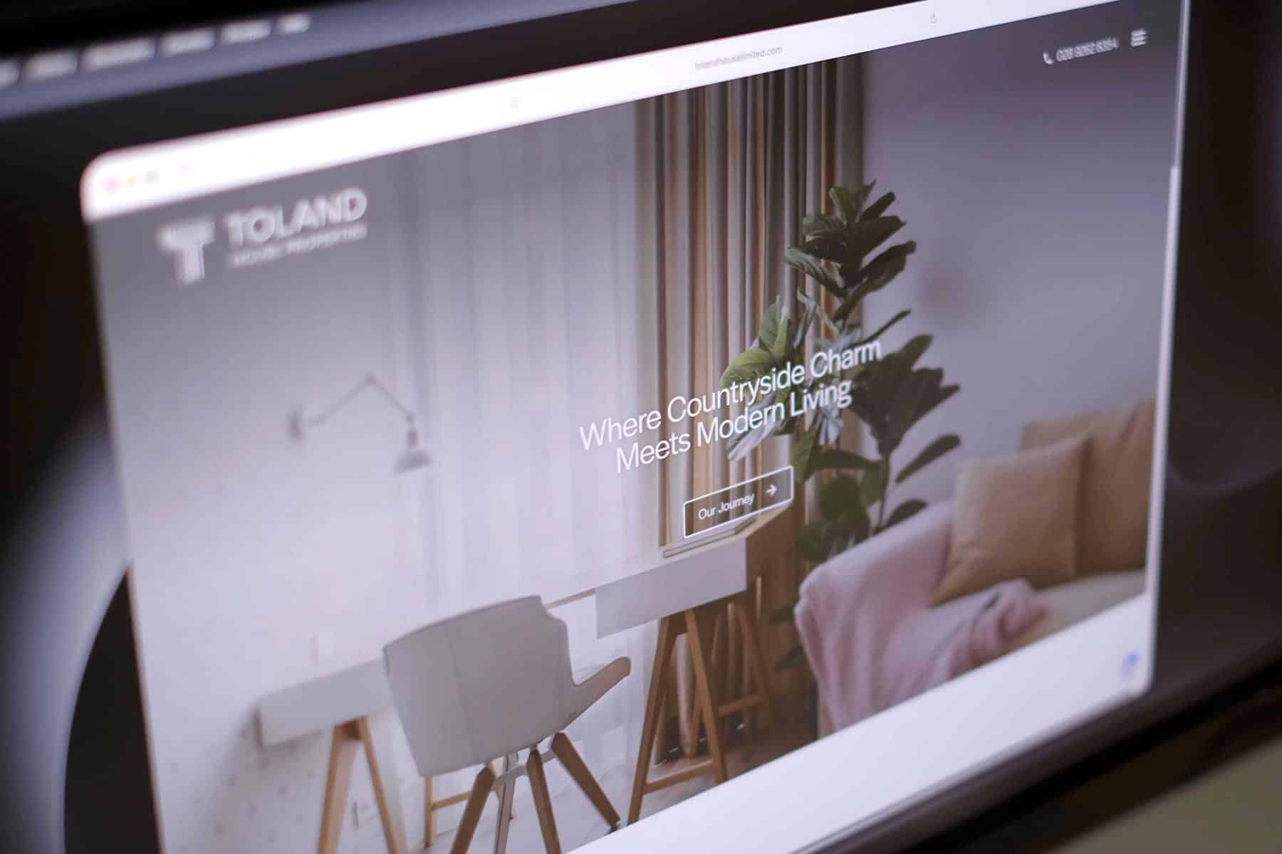
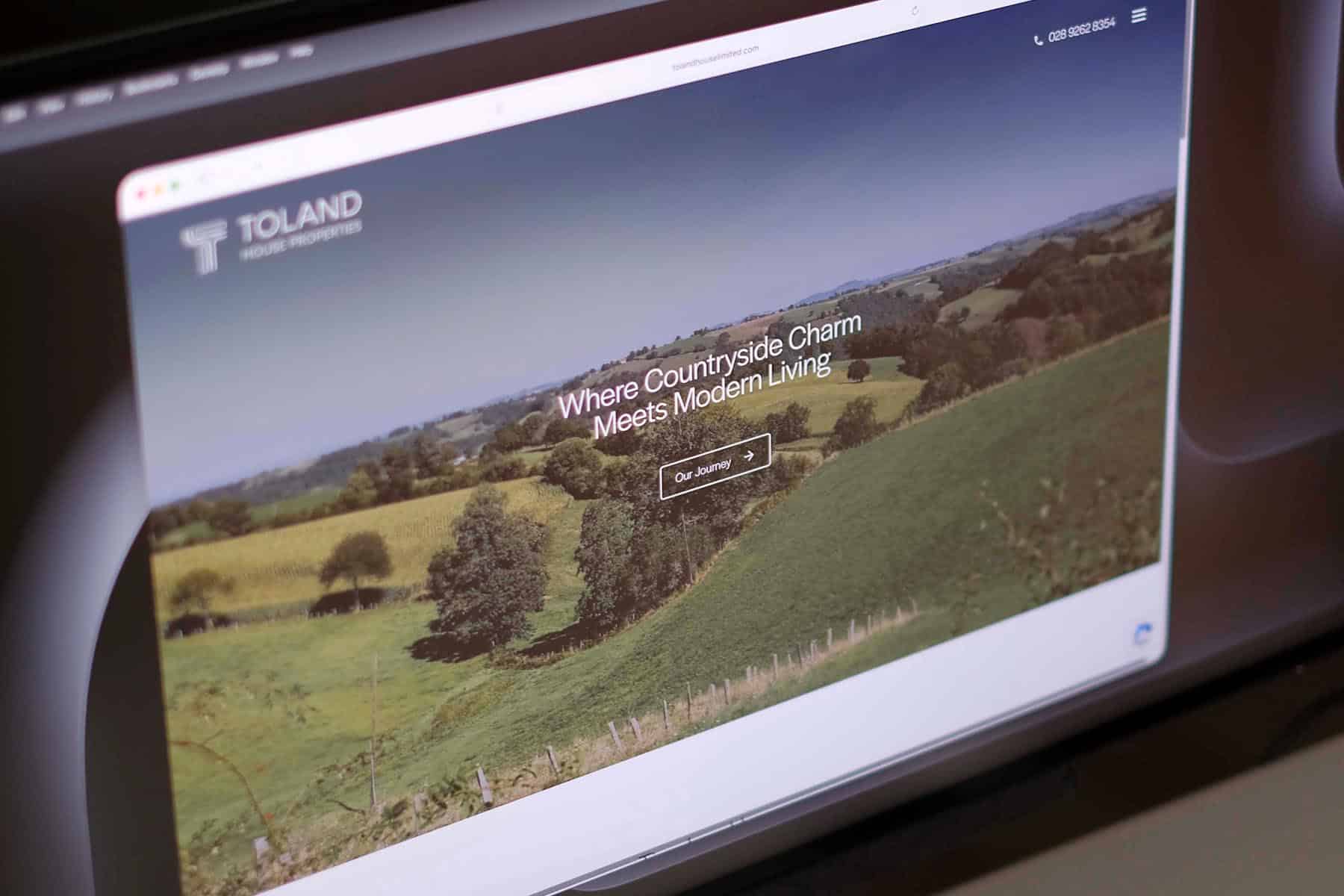
To reinforce the company’s positioning, we also developed the brand tagline: “Where Countryside Charm Meets Modern Living.” This line clearly communicates the balance Toland House Properties aims to achieve in each development.
The colour palette combines earthy greens and soft greys to reflect the rural surroundings of the homes, while the overall design relies heavily on black and white to maintain a clean, sophisticated appearance. A modern sans-serif typeface supports this minimal aesthetic and keeps the brand feeling contemporary and accessible.
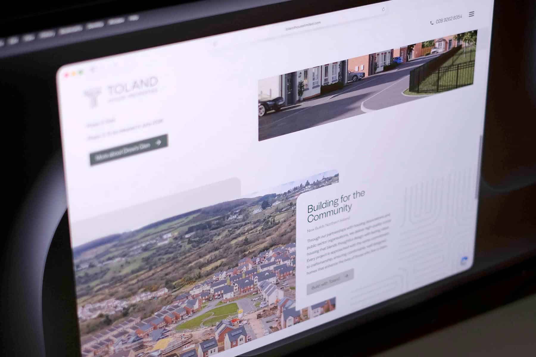
The website design builds on these branding foundations, creating a refined and forward-thinking digital presence. Subtle gradients, rounded design elements and gentle animations add visual interest without distracting from the clean layout. The result is a website that feels polished and professional while allowing the property developments themselves to remain the focus.
Together, the brand identity and website position Toland House Properties as a thoughtful, design-led developer – one that understands how to combine countryside character with modern living standards.
We use cookies to improve your experience on our site. By using our site, you consent to cookies.
Manage your cookie preferences below:
Essential cookies enable basic functions and are necessary for the proper function of the website.
Statistics cookies collect information anonymously. This information helps us understand how visitors use our website.
Google Analytics is a powerful tool that tracks and analyzes website traffic for informed marketing decisions.
Service URL: policies.google.com (opens in a new window)
You can find more information in our Redback Creations Privacy Policy and Redback Creations Privacy Policy.