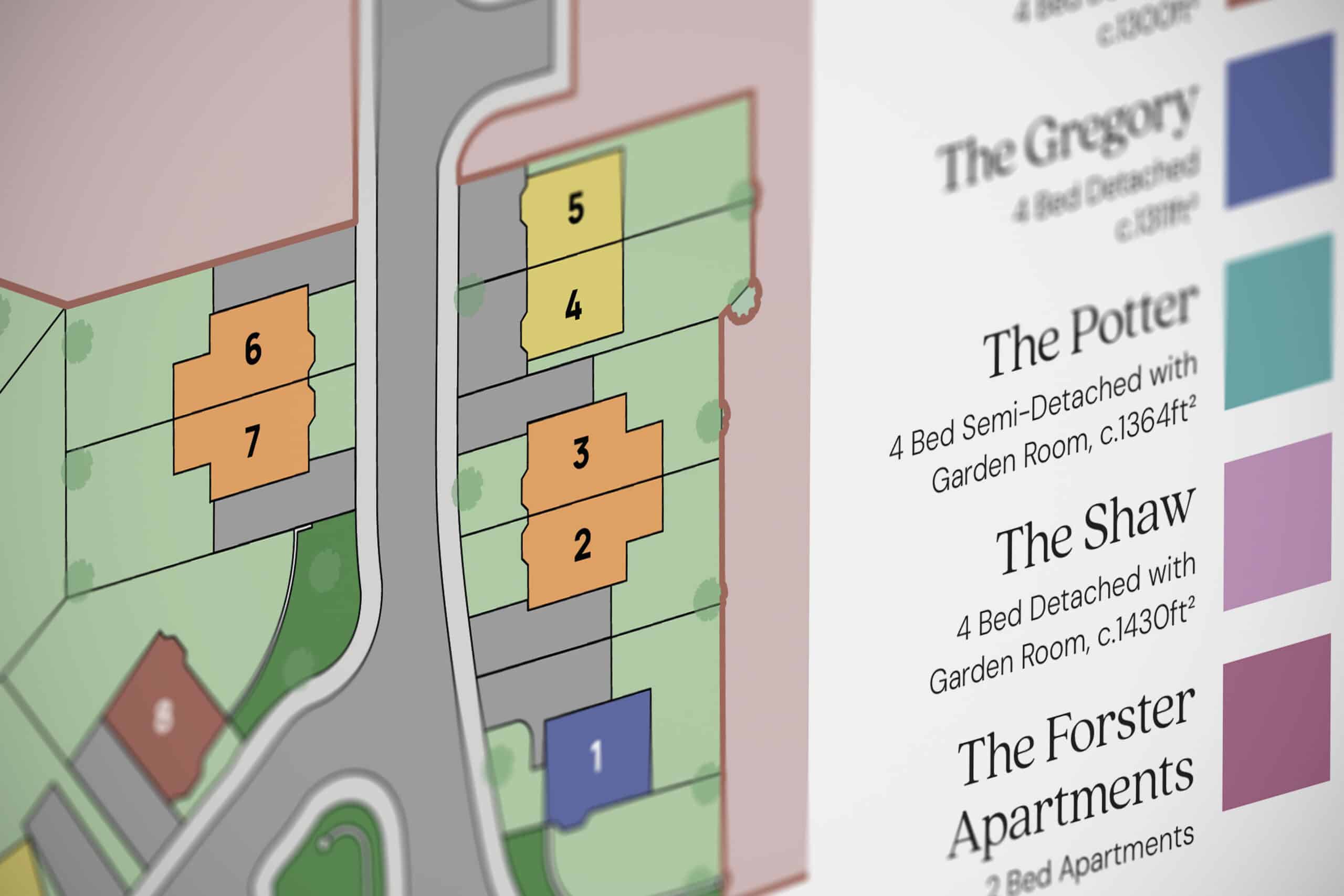
Our role was to develop a complete brand identity for the development, including logo design, colour palette, typography and marketing materials that would communicate the unique character of the homes from the very first impression.

Our role was to develop a complete brand identity for the development, including logo design, colour palette, typography and marketing materials that would communicate the unique character of the homes from the very first impression.
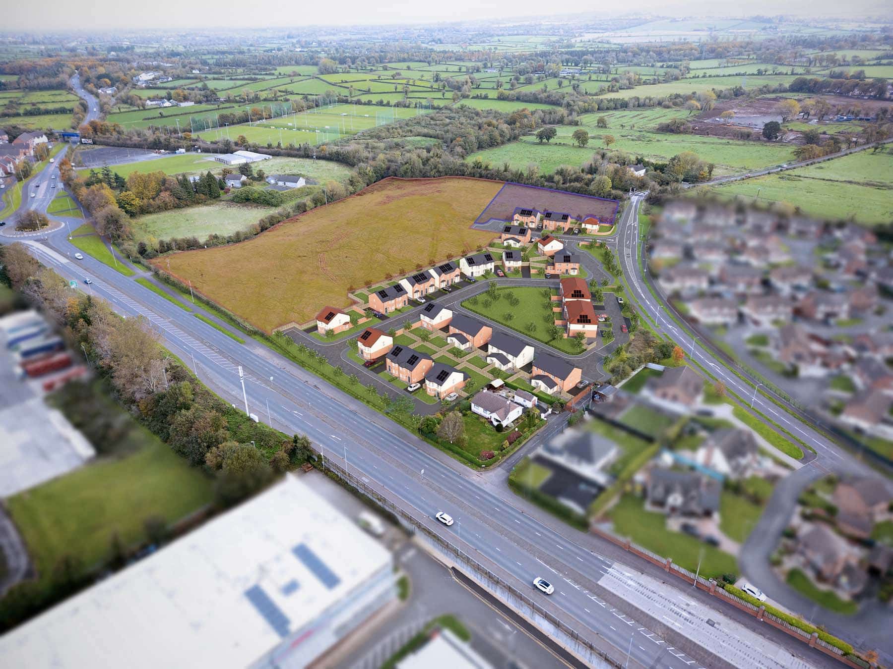
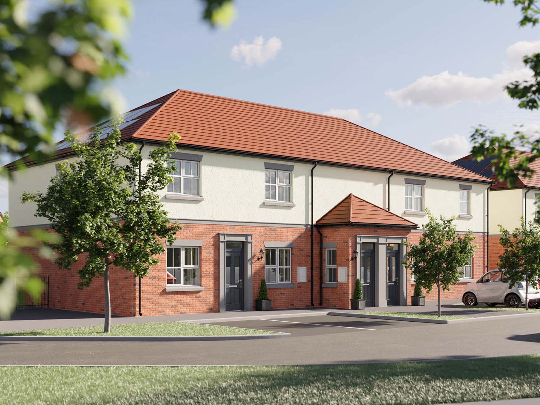
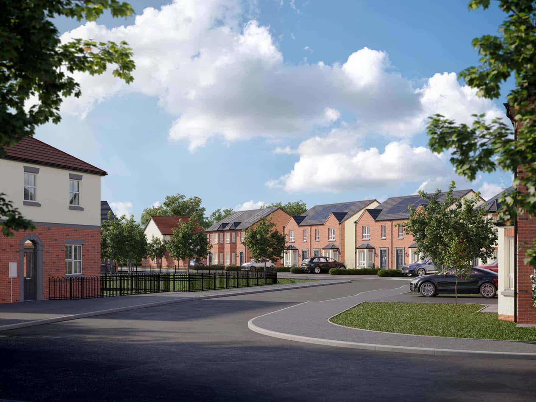
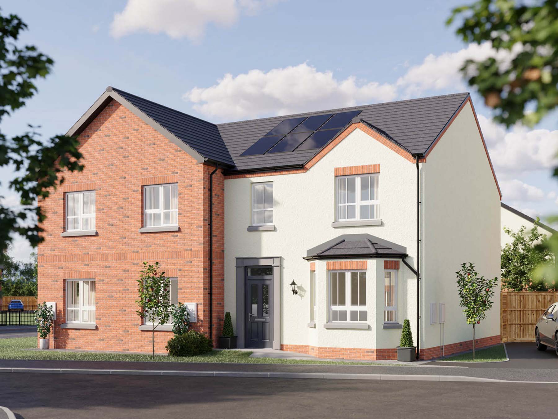
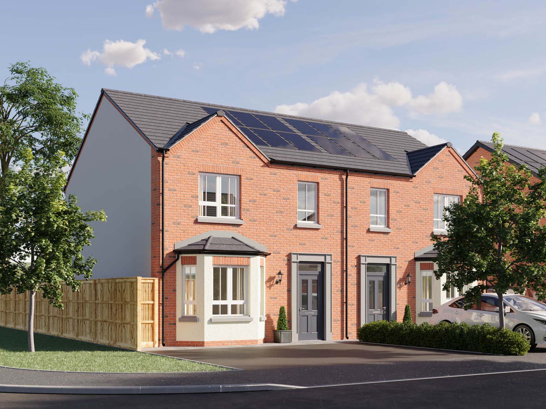
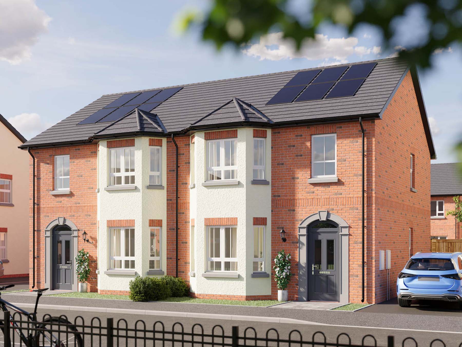
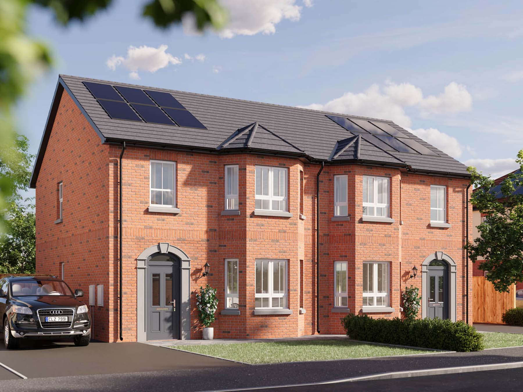
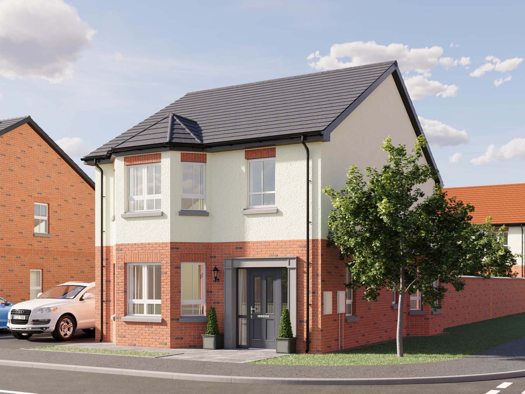
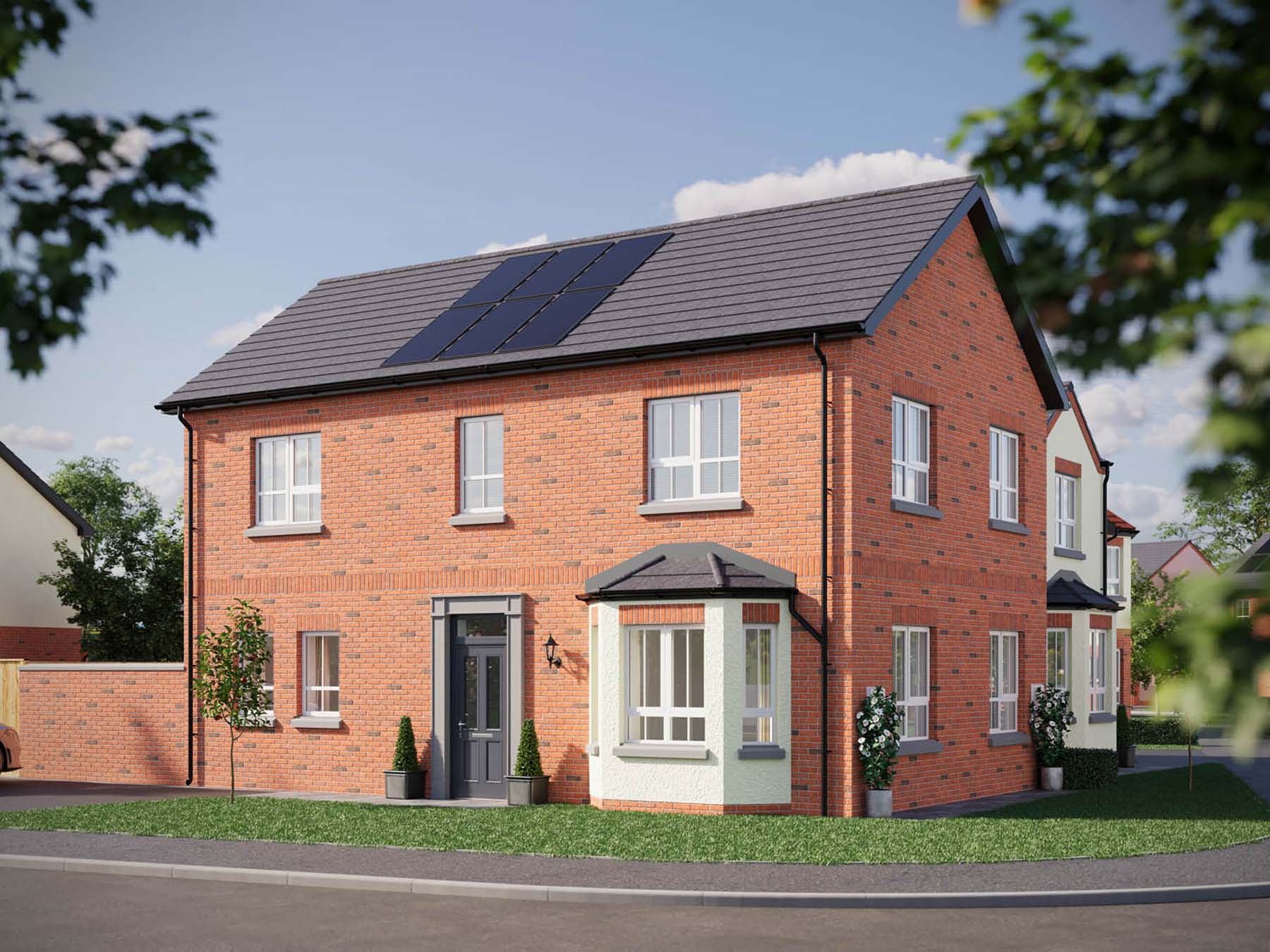
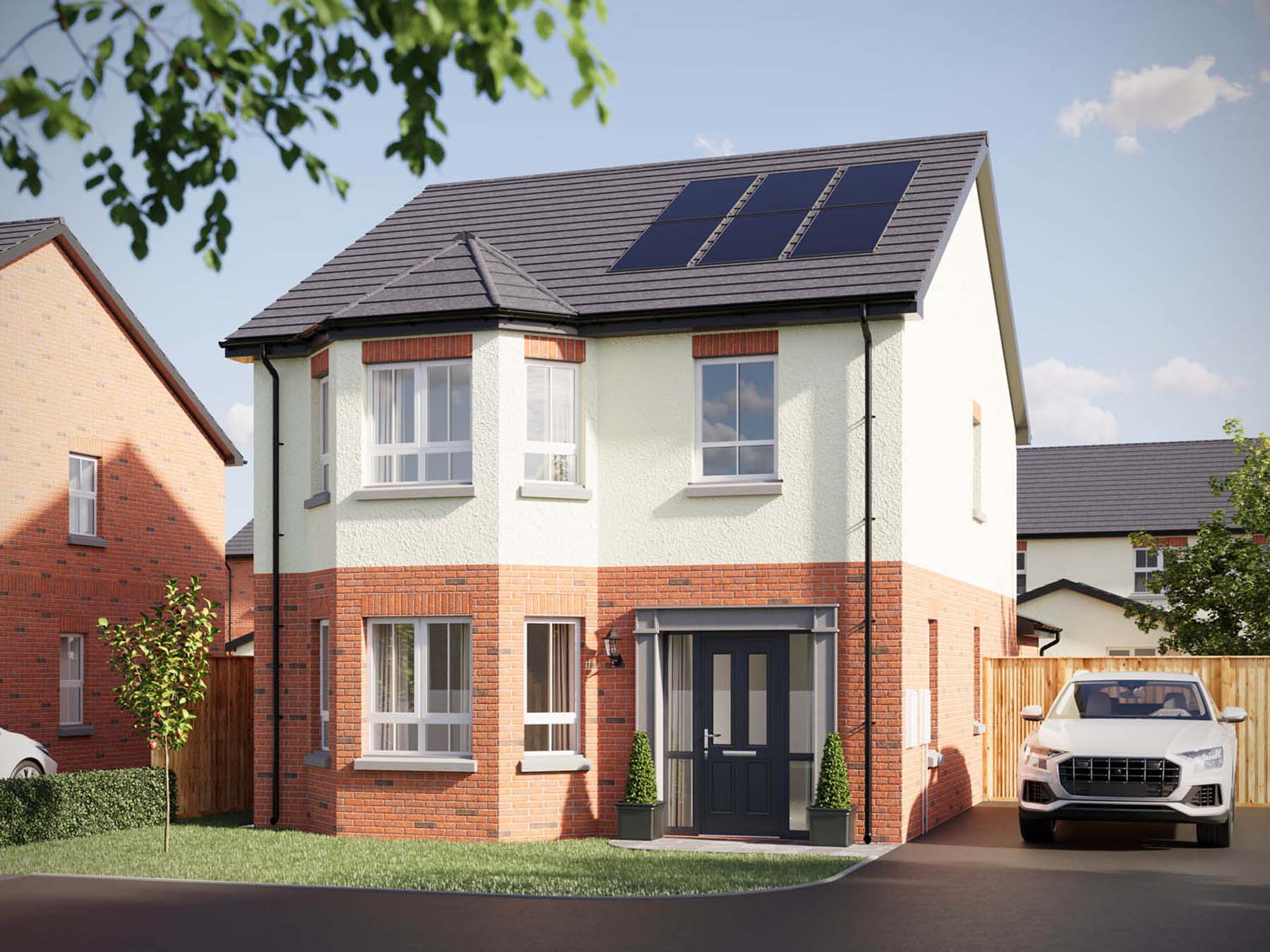
From the outset, the goal was to create a brand that reflected the architectural inspiration behind the development. The homes draw heavily from Edwardian design principles, with features such as bay windows, higher ceilings, black railings and traditional lantern lighting creating a sense of timeless character.
The branding therefore needed to capture the feeling of stepping back into a more refined architectural era, while still appealing to modern buyers looking for a well-designed and carefully managed development.
The development was also aimed at a specific audience, including downsizers and buyers looking for smaller homes or own-door apartments that still feel private and individual. It was important that the branding conveyed a sense of quality and permanence rather than the generic feel often associated with modern housing developments.
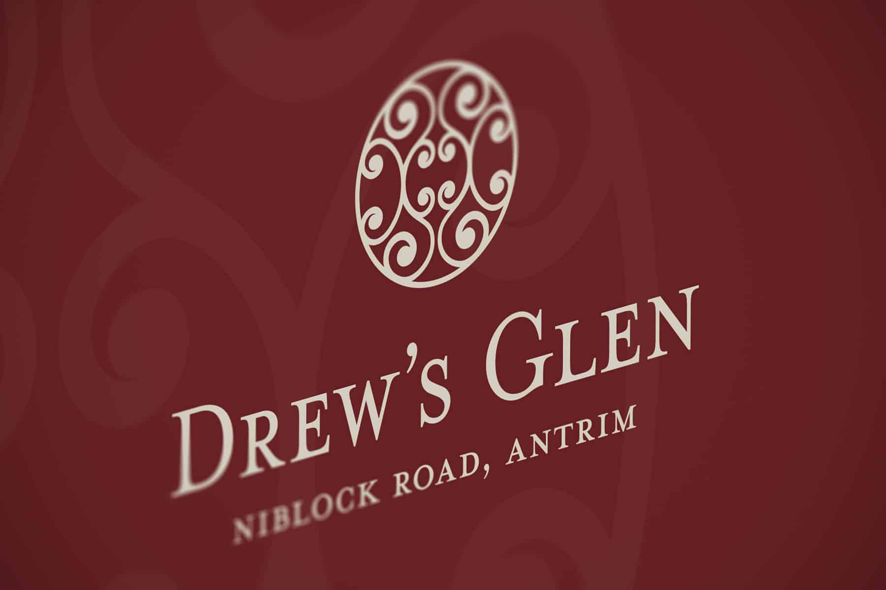
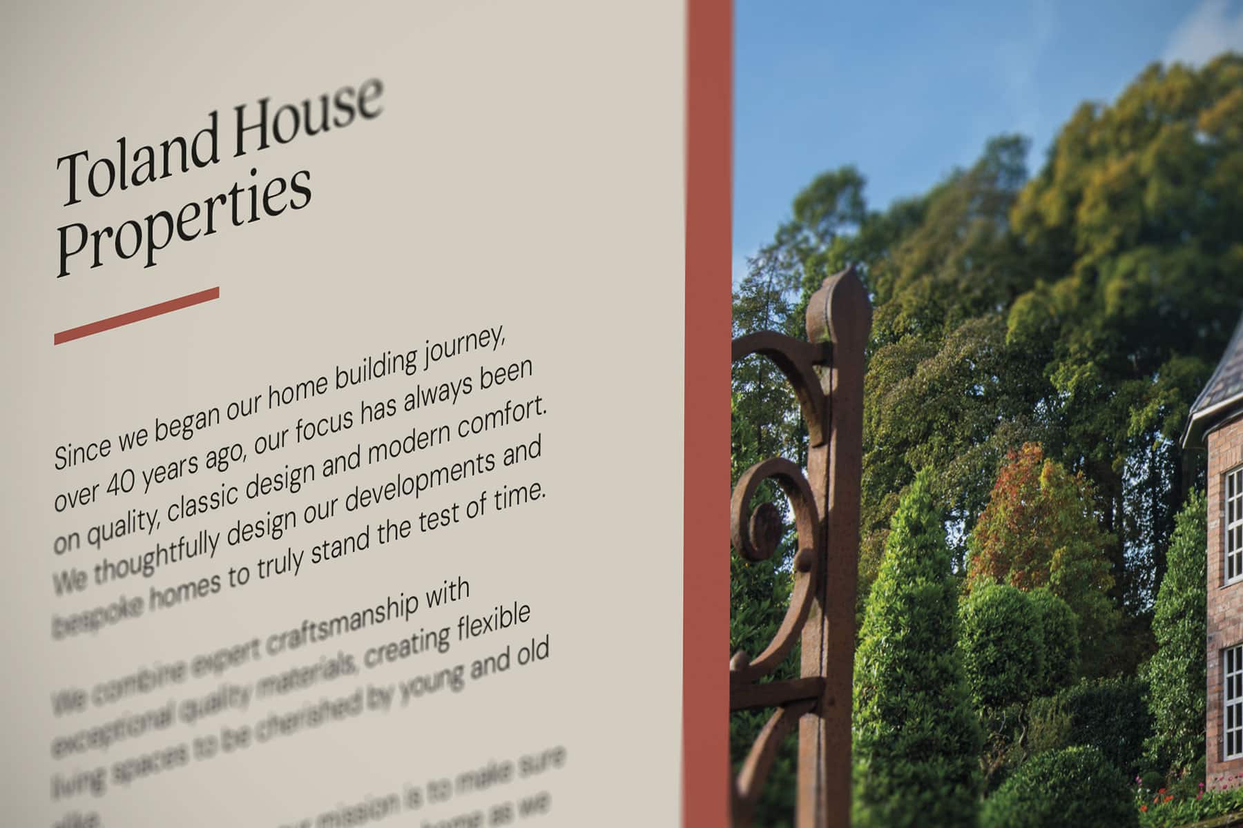
One of the first strategic decisions was the naming of the development as Drew’s Glen of Antrim. The addition of “of Antrim” gives the name a more established and prestigious tone, echoing the style of traditional estates and historic locations. This subtle change helps position the development as something more distinctive and upmarket.
The visual identity draws inspiration from Edwardian-era design and traditional British architectural detailing. The colour palette centres around a deep royal red paired with soft cream and beige tones, referencing the colours often found in Edwardian homes and interiors. Supporting accent colours such as muted greens and subtle gold tones add depth and richness to the brand while maintaining a classic feel.
The logo icon was designed within a circular form, incorporating an ornate pattern inspired by decorative wallpapers, wrought-iron railings and traditional gate designs often associated with heritage properties. The result is a mark that feels elegant and sophisticated while remaining simple enough to scale effectively across a wide range of applications.
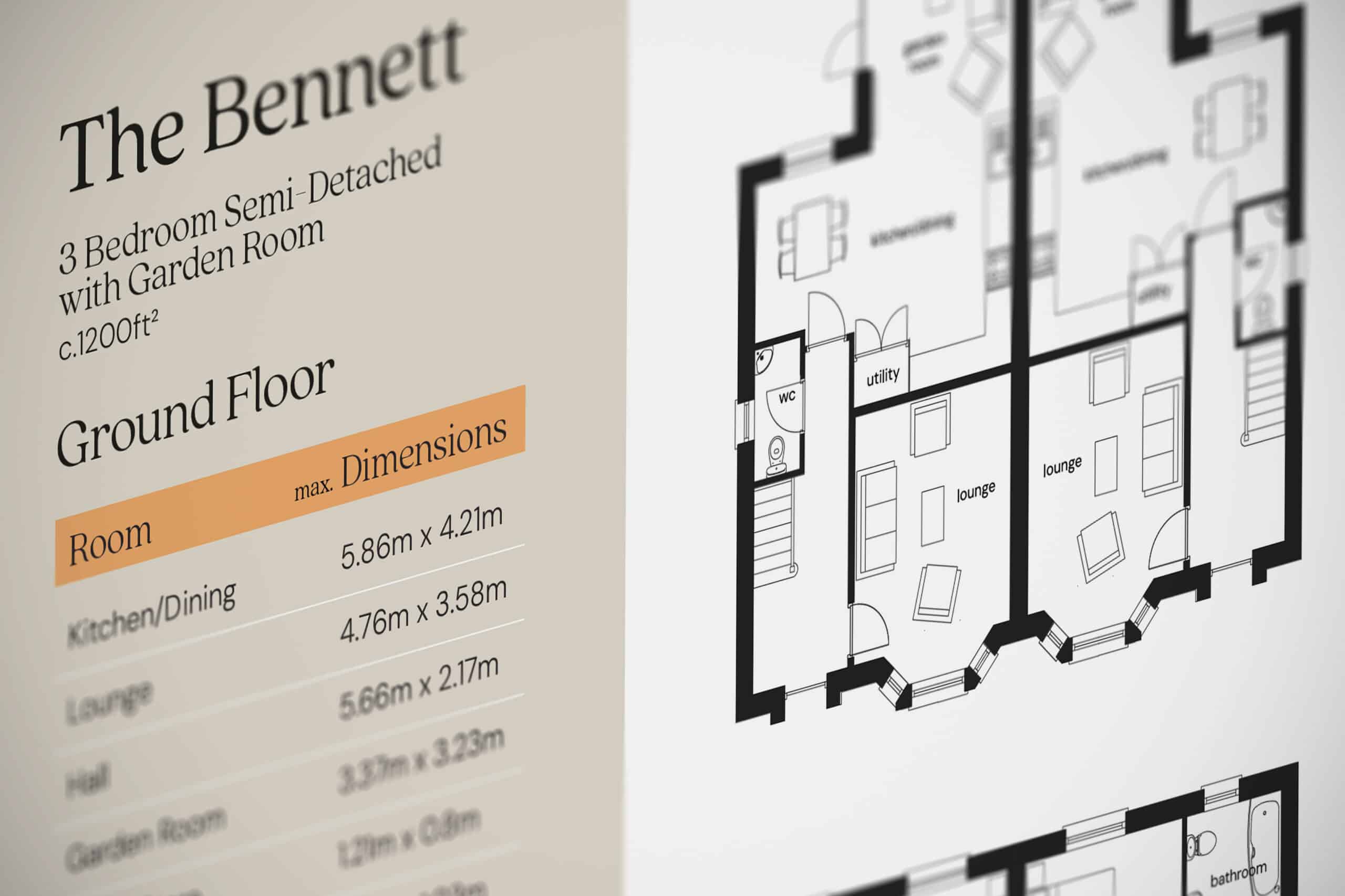
This icon is also used as a subtle graphic texture within marketing materials, providing depth and visual interest across brochures, billboards and other promotional pieces while maintaining a consistent identity.
The final branding balances heritage character with modern clarity, helping communicate the unique vision behind the development. Through the use of classic colour palettes, refined typography and decorative design details, Drew’s Glen of Antrim is presented as a development that offers something different from the standard new-build estate – a place where traditional architectural charm meets contemporary living.
We use cookies to improve your experience on our site. By using our site, you consent to cookies.
Manage your cookie preferences below:
Essential cookies enable basic functions and are necessary for the proper function of the website.
Statistics cookies collect information anonymously. This information helps us understand how visitors use our website.
Google Analytics is a powerful tool that tracks and analyzes website traffic for informed marketing decisions.
Service URL: policies.google.com (opens in a new window)
You can find more information in our Redback Creations Privacy Policy and Redback Creations Privacy Policy.