Because the school was formed from the merger of three schools, the branding process required careful consideration of many perspectives. The identity needed to represent a fresh start while also acknowledging the history and communities connected to the previous schools.
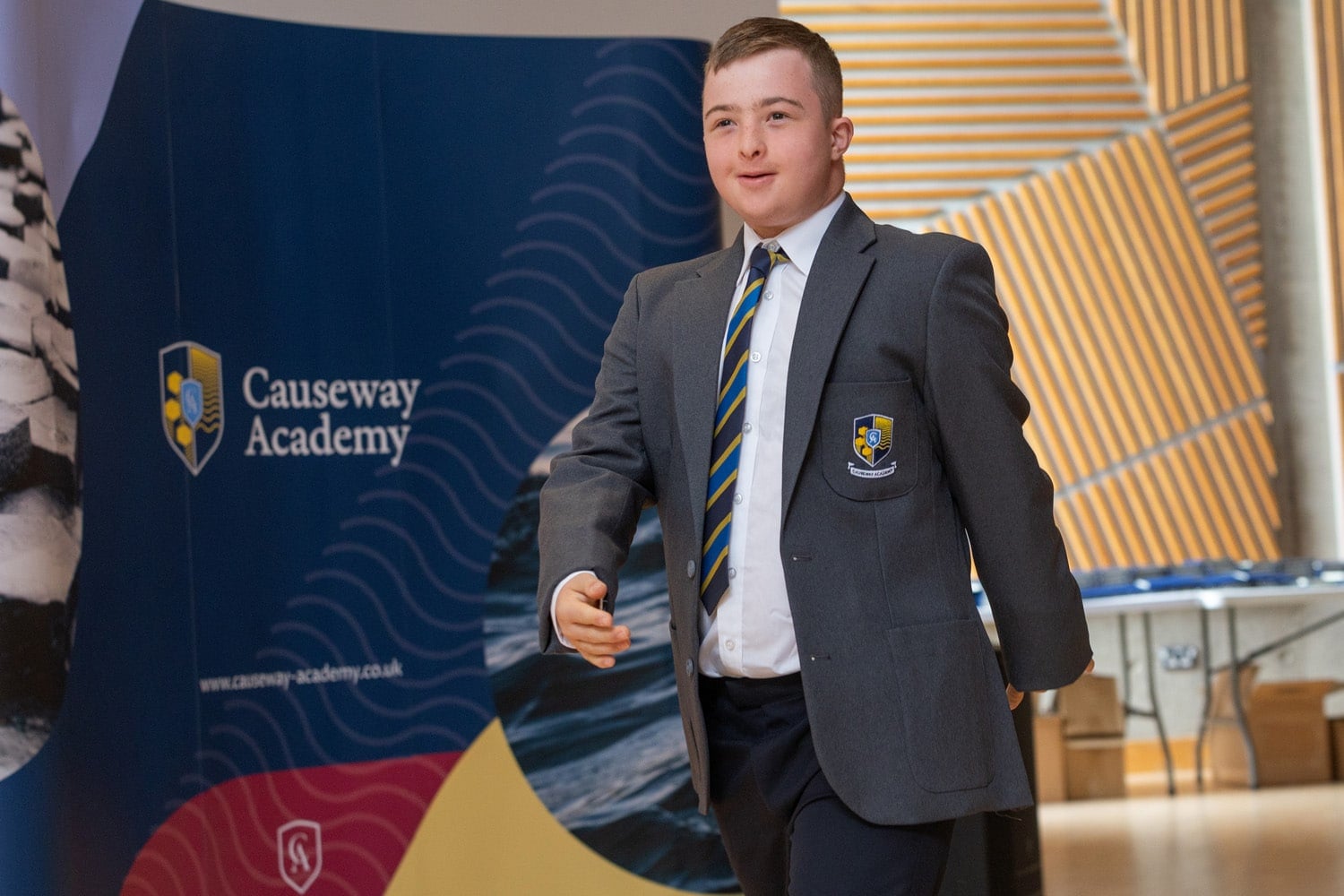
Our role was to create a clear and distinctive identity that could bring these groups together while establishing Causeway Academy as a modern and forward-looking school.
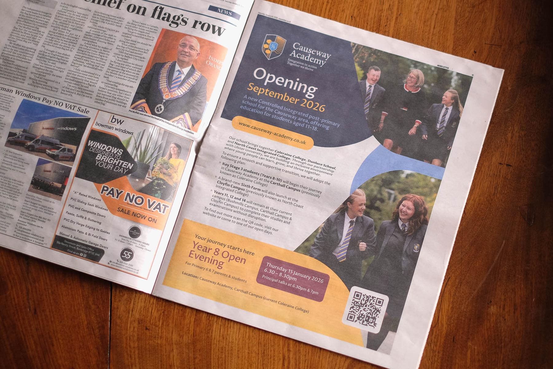
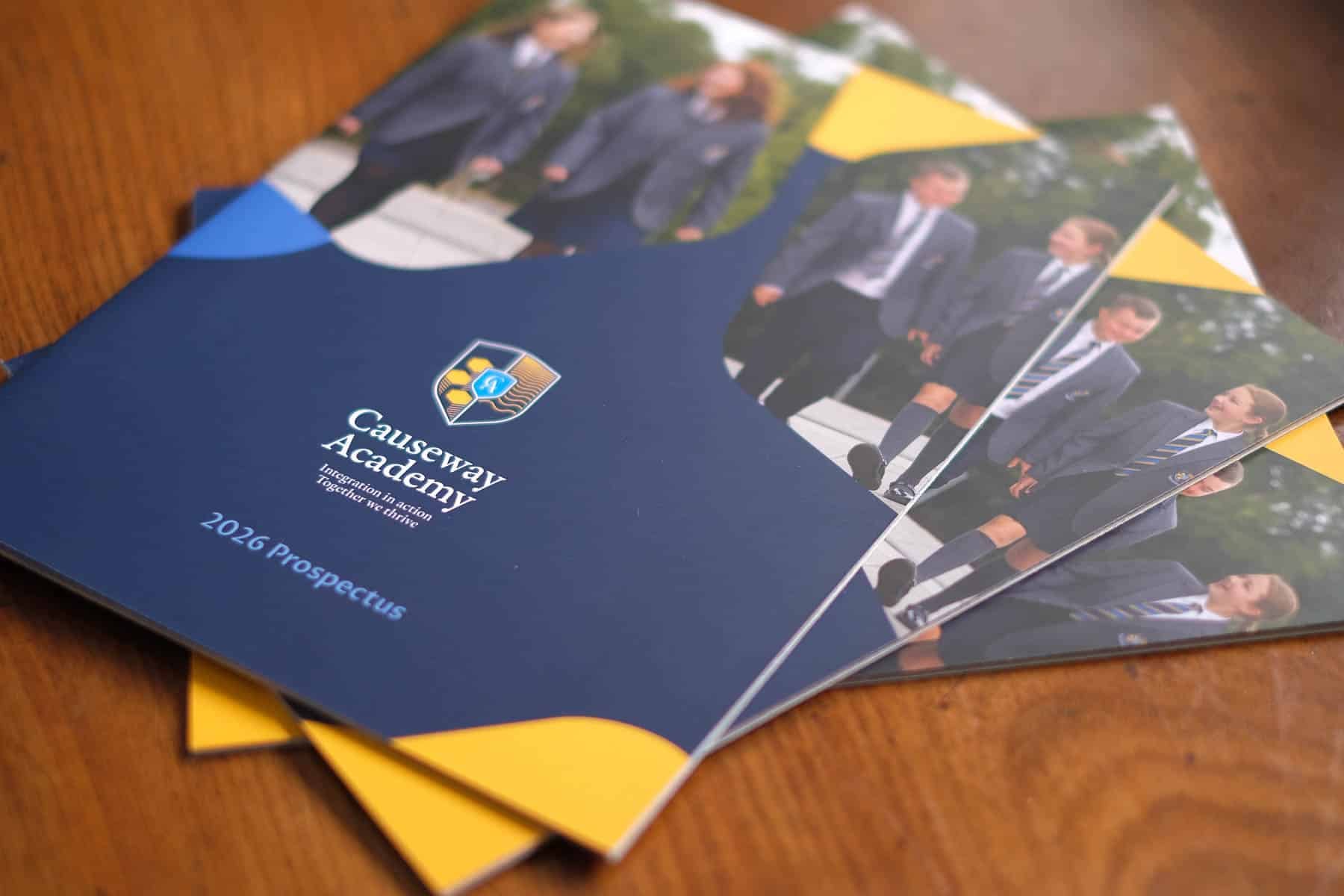
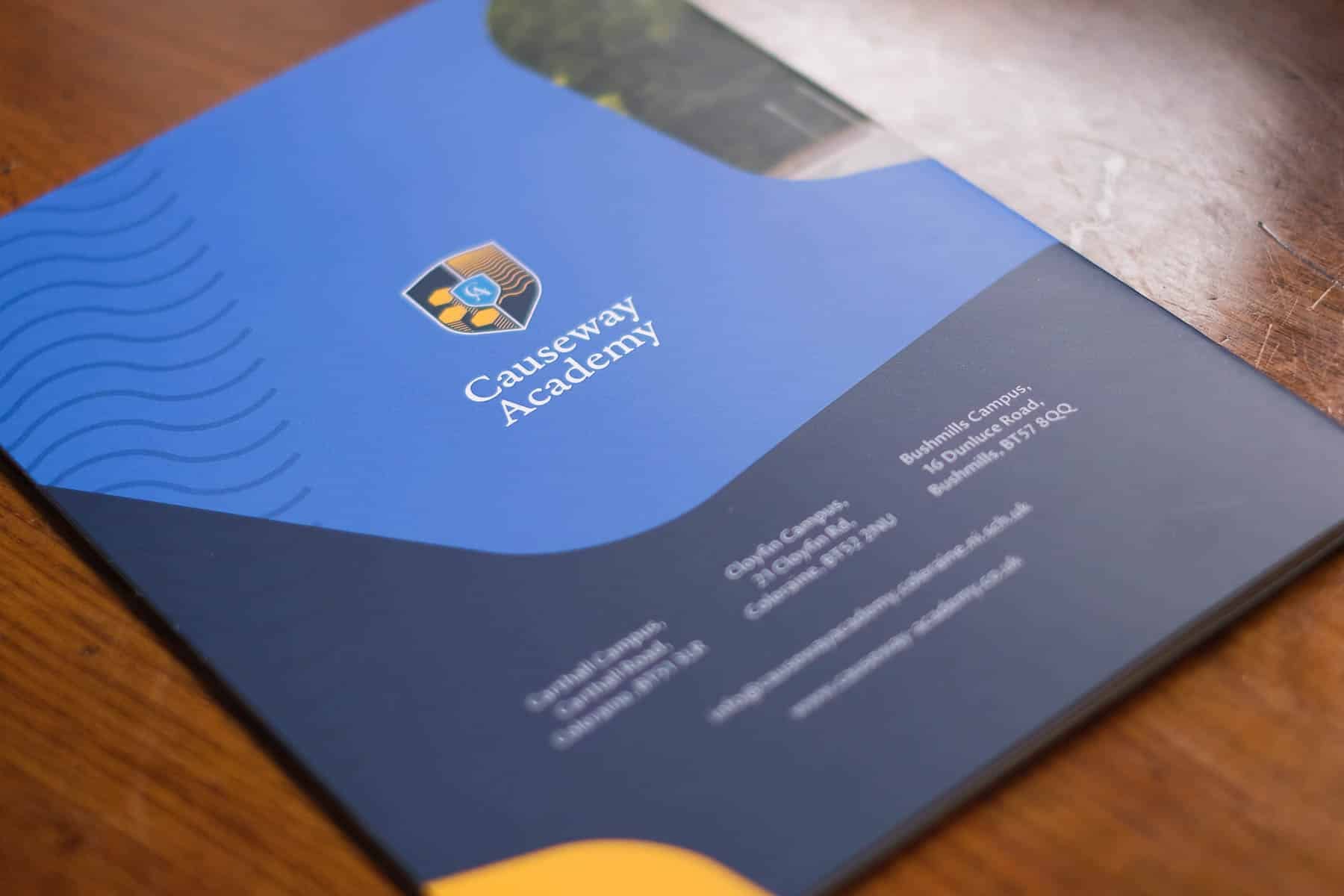
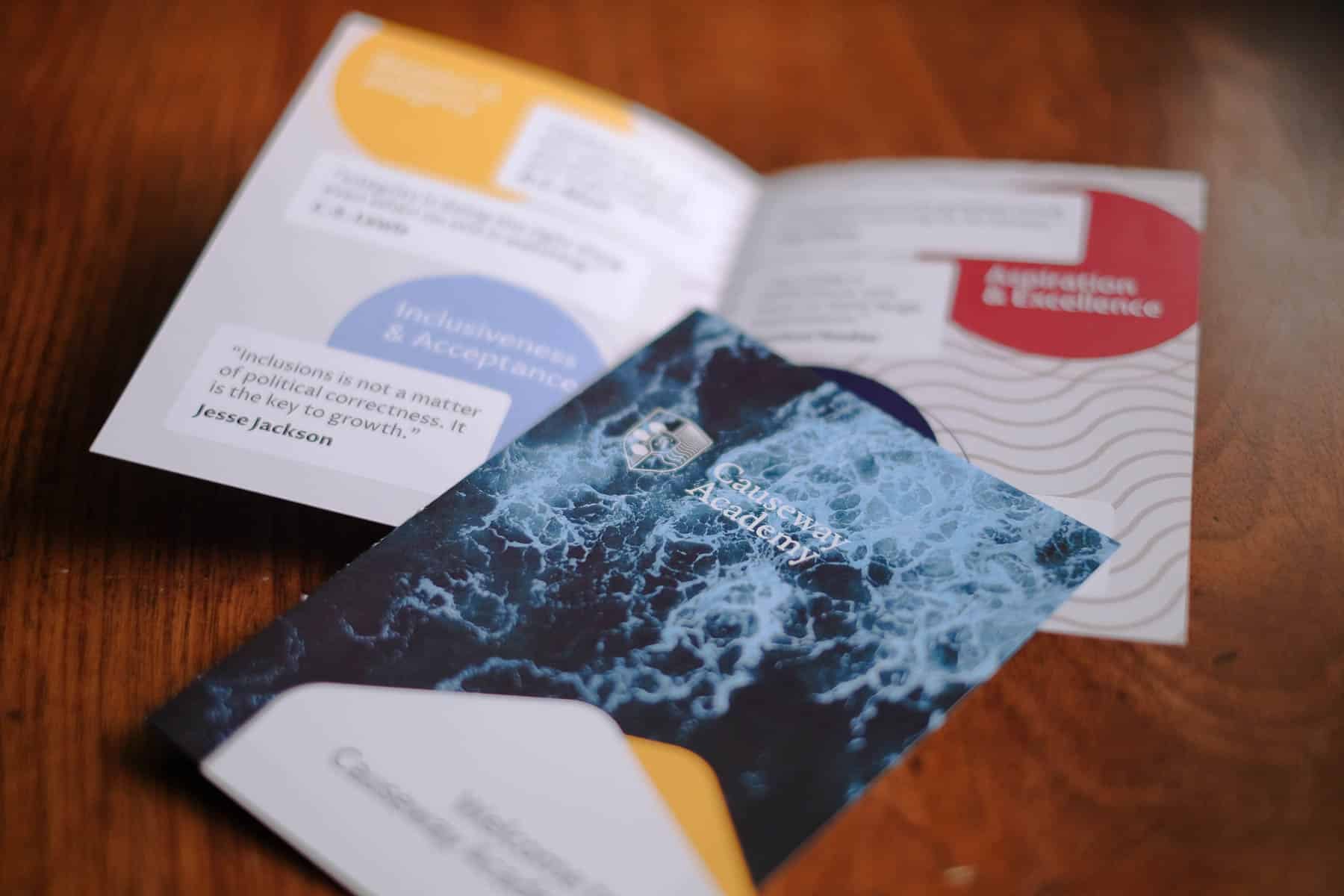
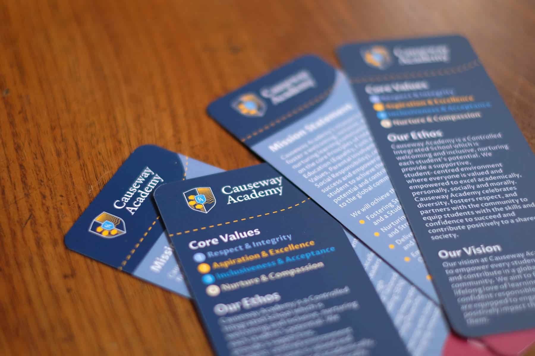
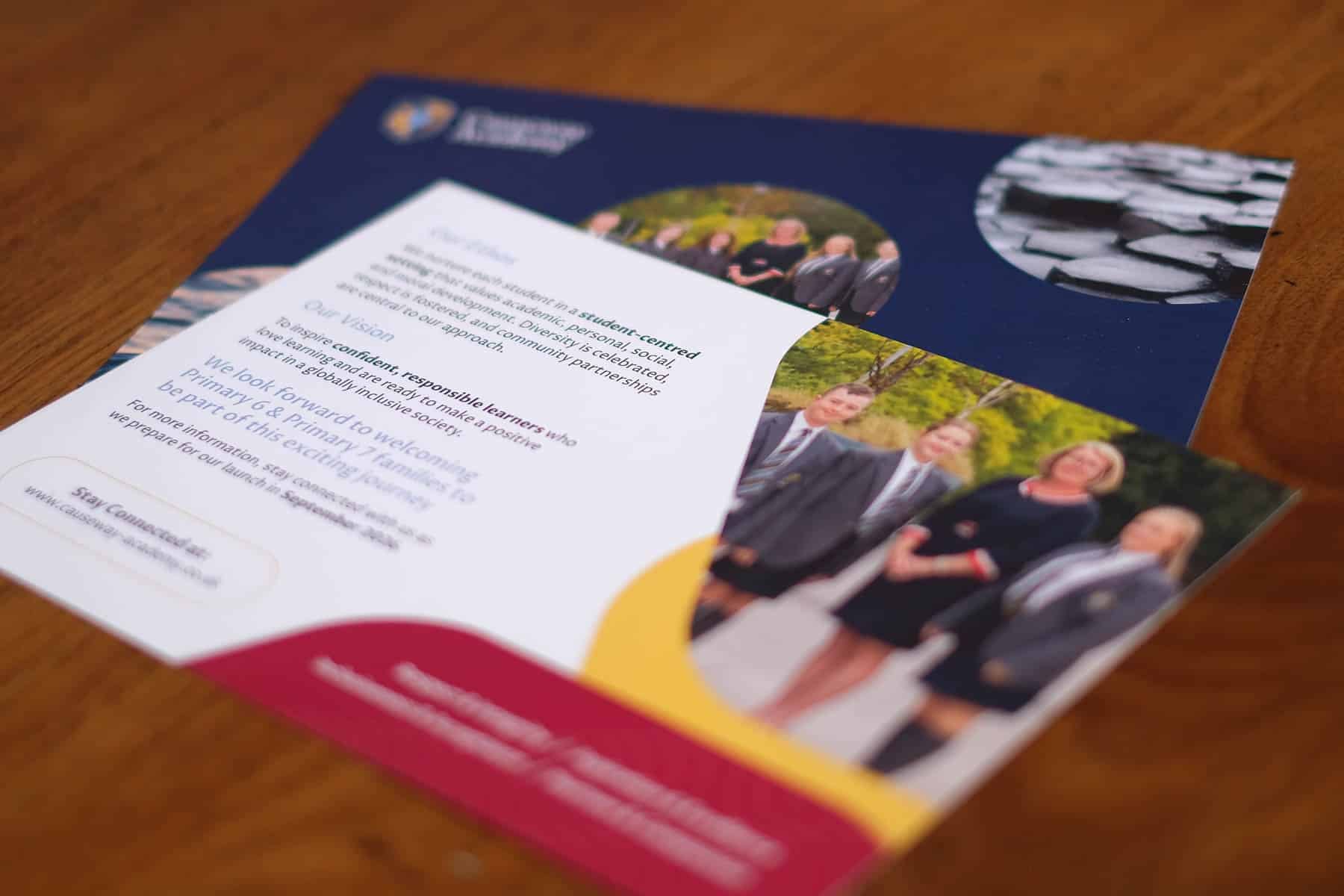
The project began with the development of the school’s crest and logo system. The design incorporates a number of symbolic elements connected to both the school’s location and its purpose. The crest features three hexagonal stones inspired by the famous basalt columns of the Causeway Coast, representing the three schools joining together to form the new academy.
Within the crest, interlocking “C” and “A” initials highlight the school’s name and its commitment to integrated education, while the combination of solid stones and flowing water represents an approach to education that is both strong and adaptable. The stepping-stone concept also reflects the journey each student takes as they progress through their education.
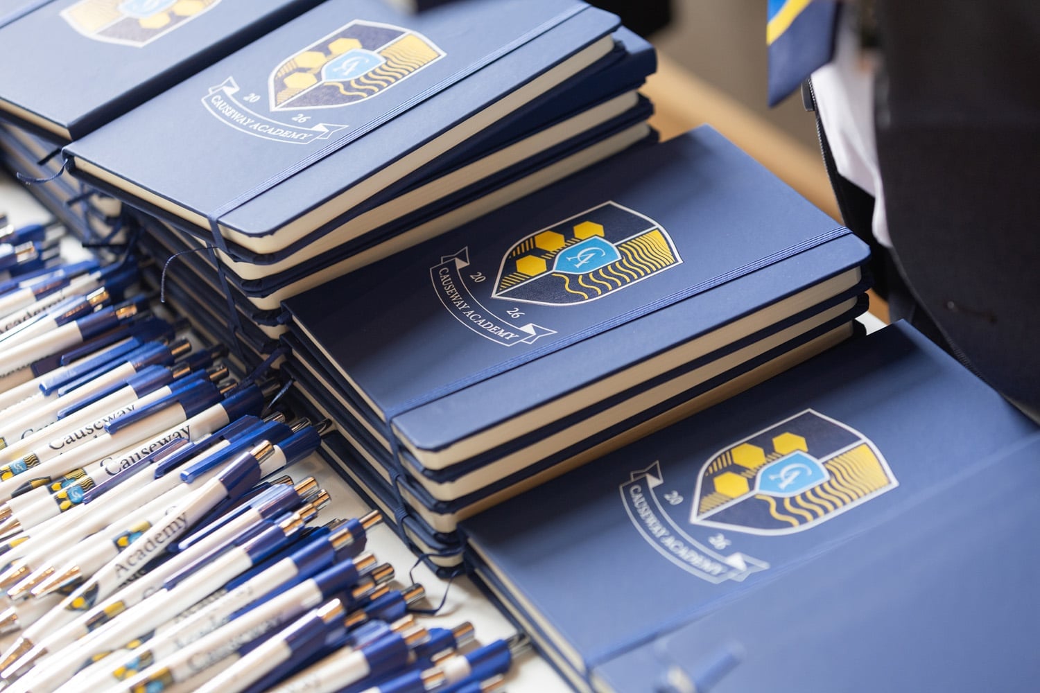
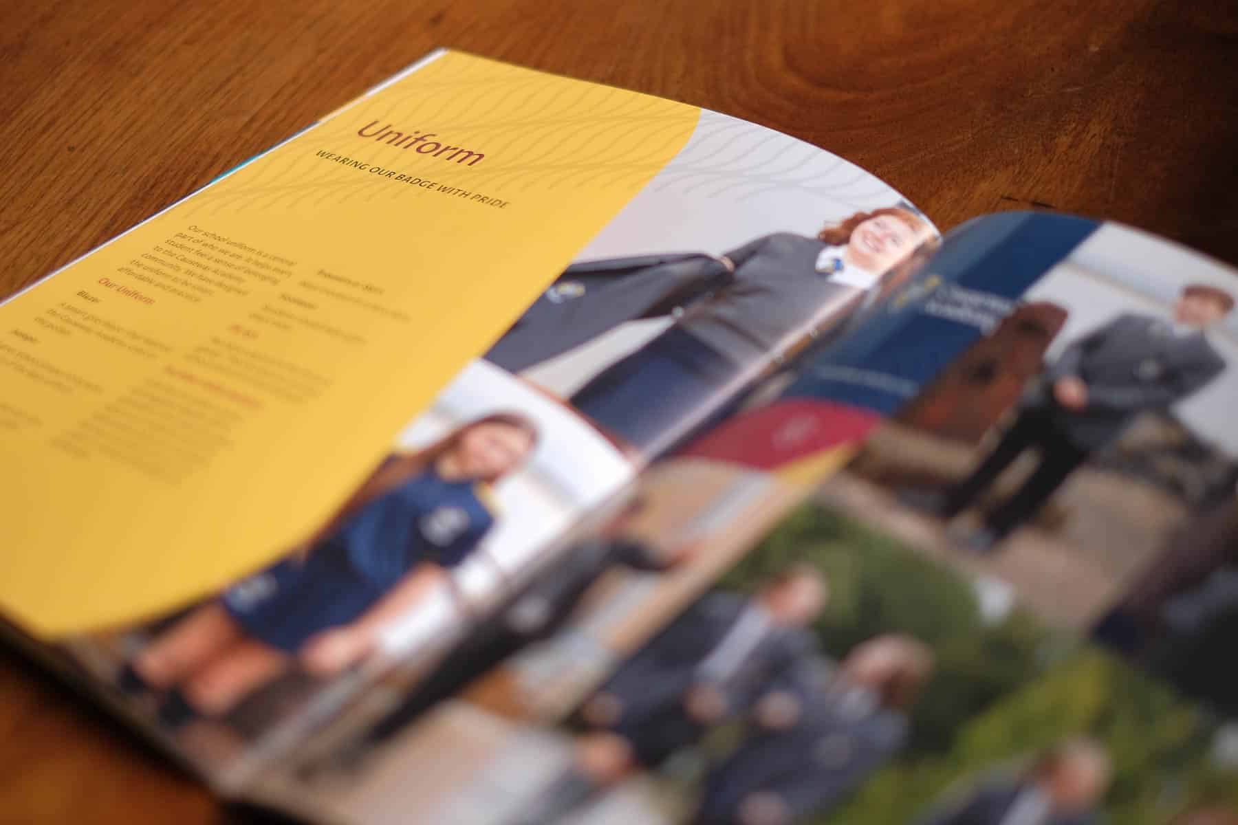
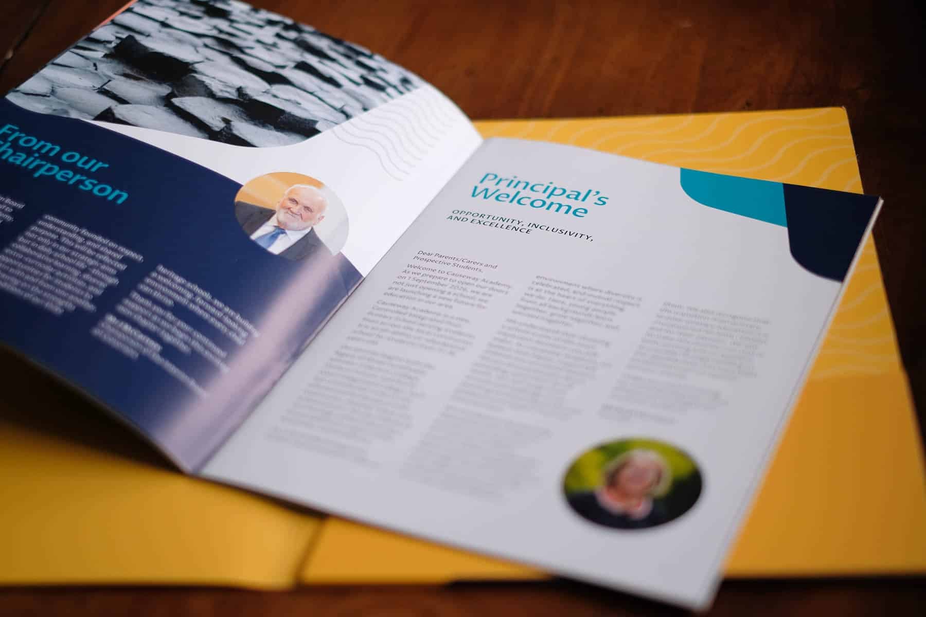
From this foundation we developed a comprehensive set of brand guidelines to ensure the school could present itself consistently across every platform and department. The guidelines define the correct use of the logo, colour palette, typography, imagery and graphical elements, giving staff clear guidance on how to produce materials that align with the academy’s identity.
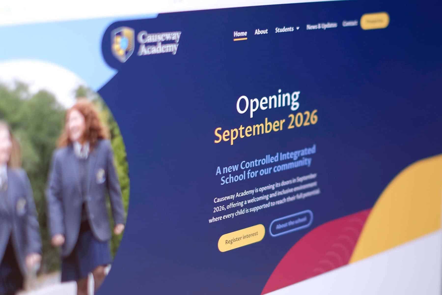
The colour palette centres around a deep navy, gold and blue drawn from the crest, supported by a wider range of secondary colours used for contrast and communication.
Typography was standardised using a single versatile typeface, helping all communications feel clean, modern and easy to read.
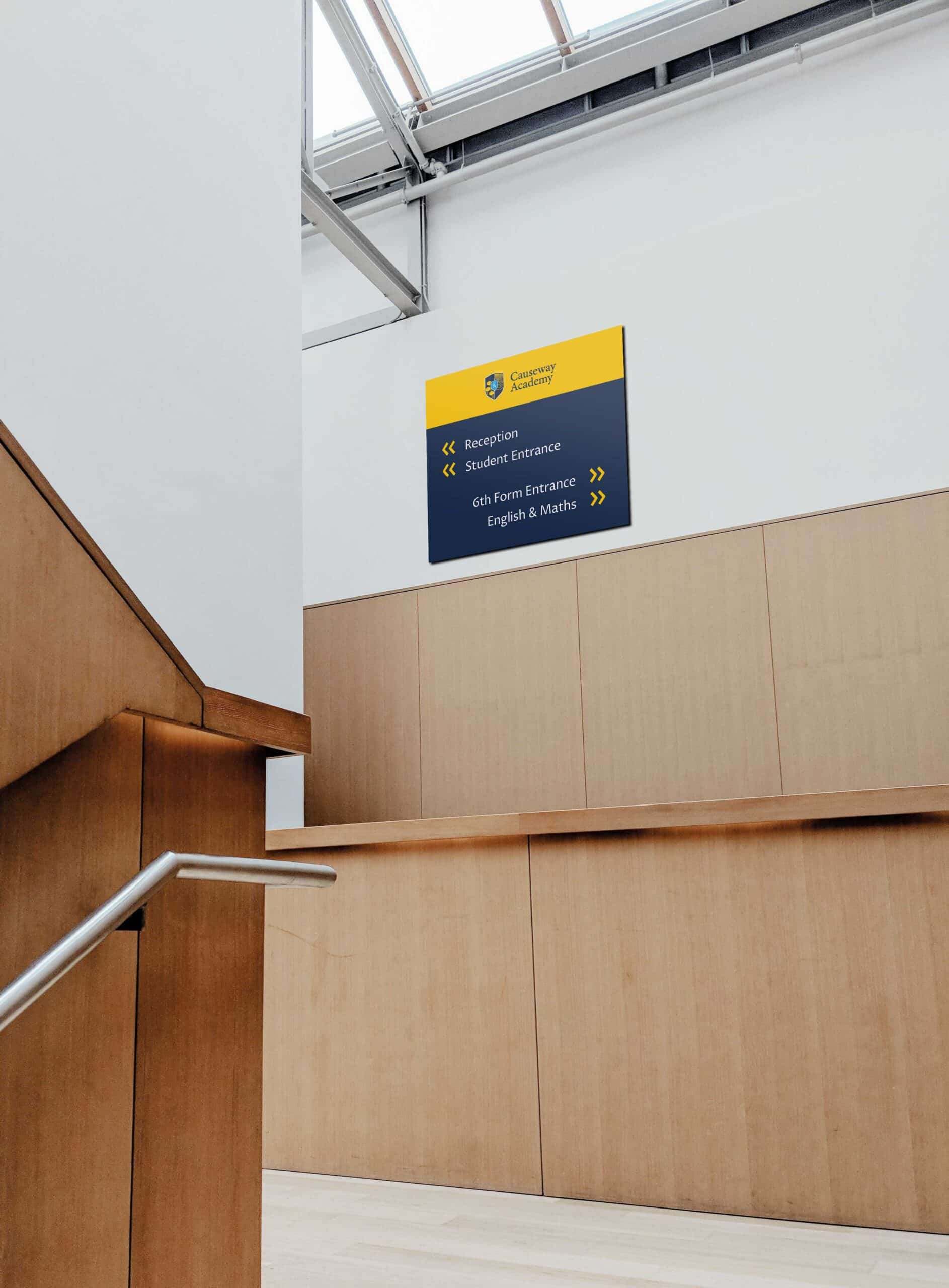
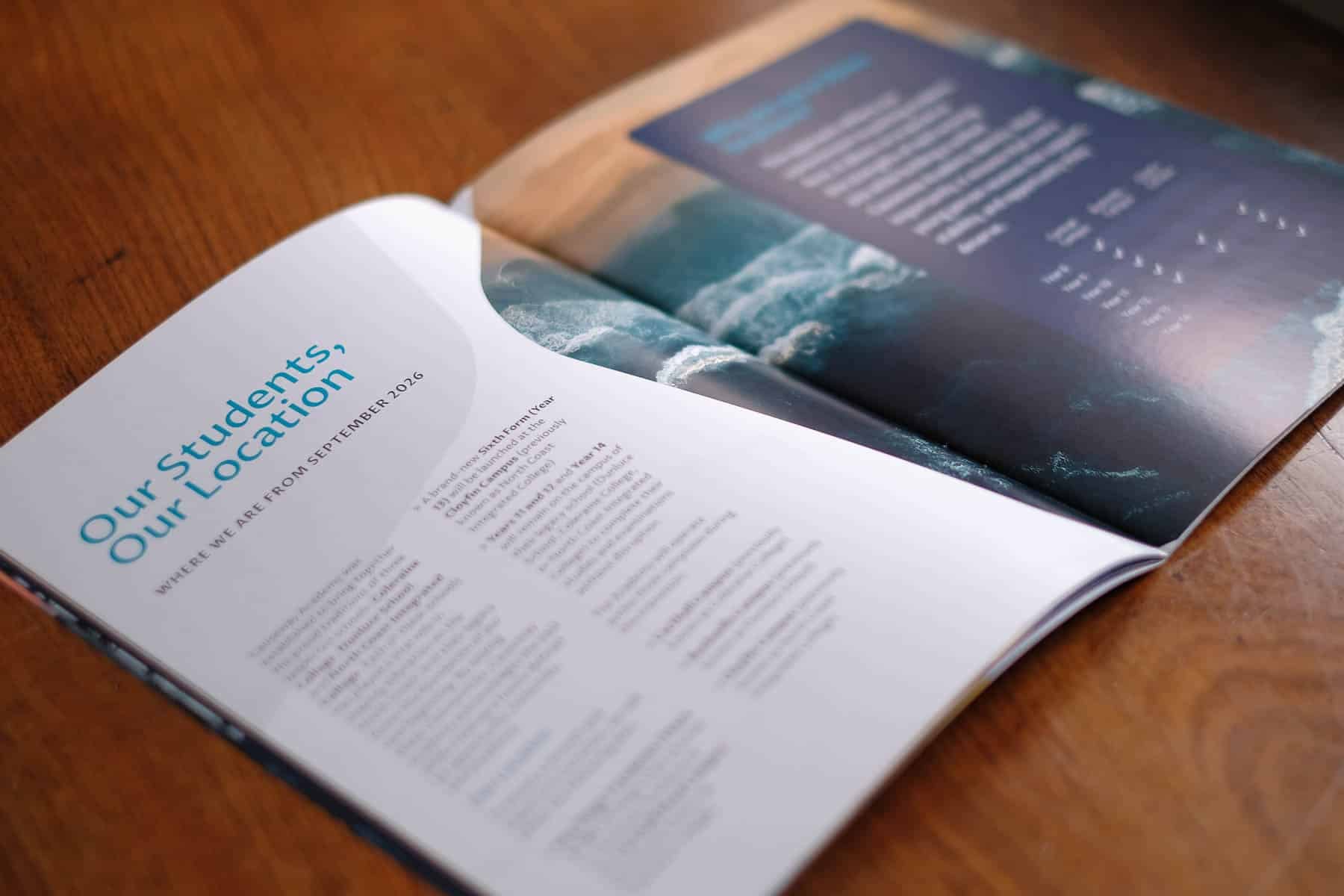
Distinctive graphic elements derived from the crest — particularly the hexagonal shapes inspired by the basalt columns — are used throughout the brand to create recognisable layouts and visual patterns. These shapes can frame images, highlight key information or subtly form background textures across both print and digital materials.
Alongside the branding system, we designed and developed the school’s website, providing an accessible platform for parents, students and the wider community to learn about the academy. The website reflects the same structured and modern visual style defined within the brand guidelines.
The project also extended across physical spaces within the school. We created a wide range of printed materials and signage, including internal graphics and external wayfinding, ensuring the identity is visible and consistent across the entire campus environment.
By developing a comprehensive brand toolkit and clear visual standards, Causeway Academy now has a strong and unified identity that can grow with the school for many years to come – supporting communication with students, parents, staff and the wider community.
