Our work focused on creating a strong brand identity alongside a clean, functional ecommerce website that allows the product range to take centre stage.

Our work focused on creating a strong brand identity alongside a clean, functional ecommerce website that allows the product range to take centre stage.
The brief was to develop a brand that captured the personality of the WinePig name while also feeling credible within the premium drinks market. The identity needed to be memorable and flexible – something that could work across packaging, digital marketing and the website itself.
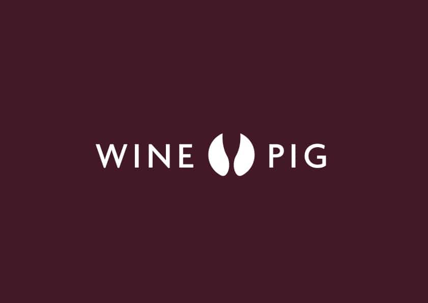
Central to this was the creation of a unique brand mark that visually brings together the two elements within the name: wine and pig.
The resulting logo cleverly combines both ideas in a single icon. Using negative space, the mark forms the shape of a pig’s hoof while also suggesting the bowl and stem of a wine glass. This approach creates a distinctive symbol that immediately reflects the brand name while remaining simple and recognisable.
Because the icon works independently from the wordmark, it can be used across a wide range of applications – from social media profiles to packaging and promotional materials – while maintaining a consistent brand identity. It also works effectively in both colour and black-and-white formats, ensuring flexibility wherever the brand appears.
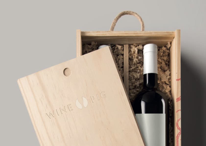
Alongside the logo, the colour palette was refined to better reflect the premium nature of the products. The previous blue and grey tones were replaced with richer deep reds and burnt oranges, creating a warmer and more classic feel that aligns more closely with the wine industry.
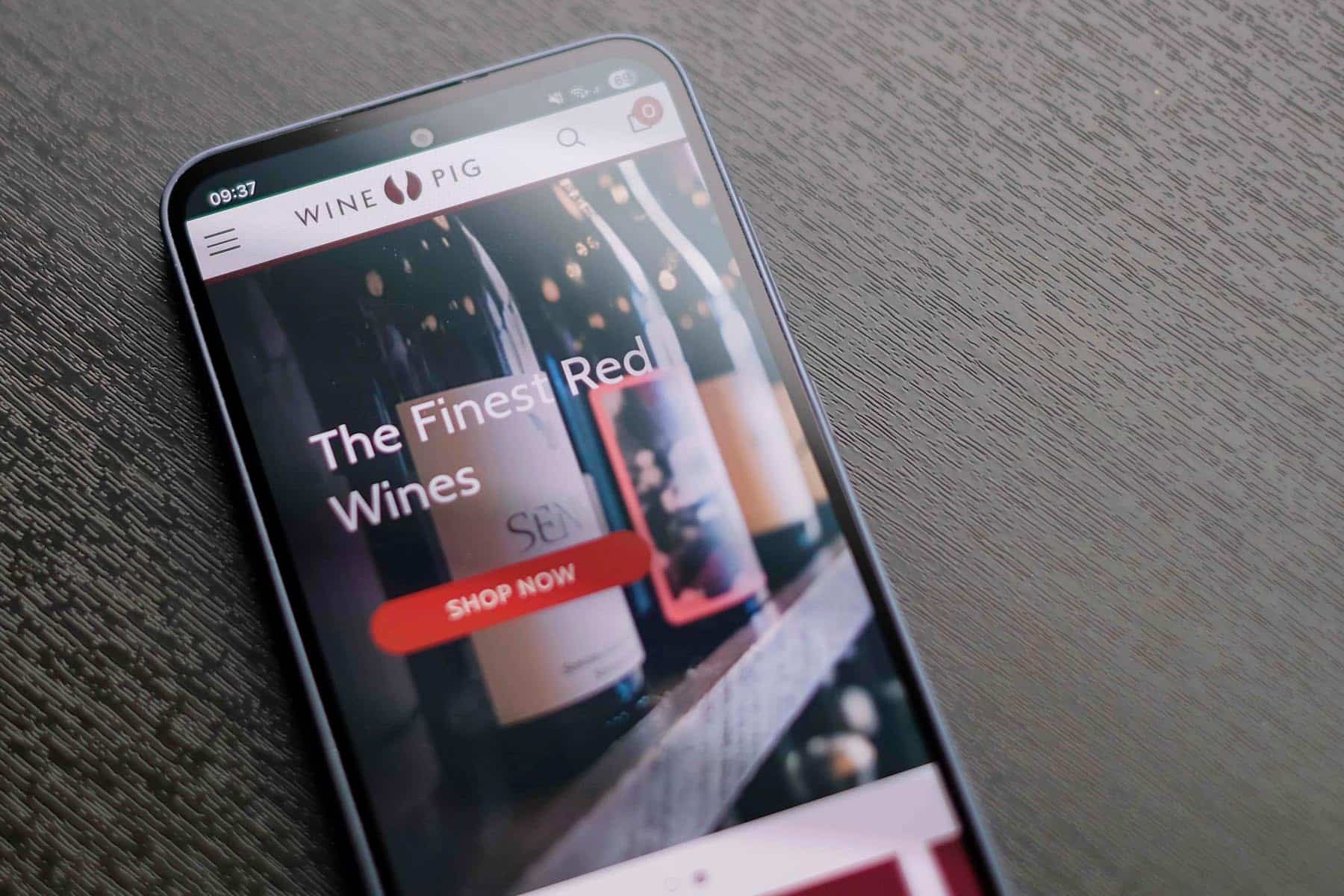
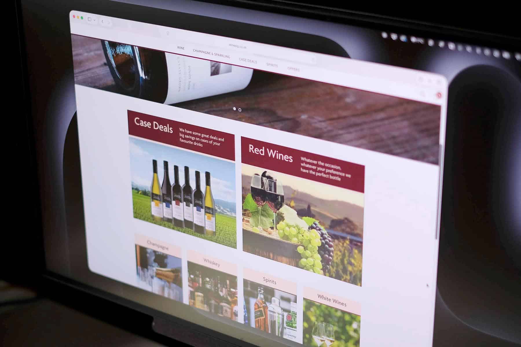
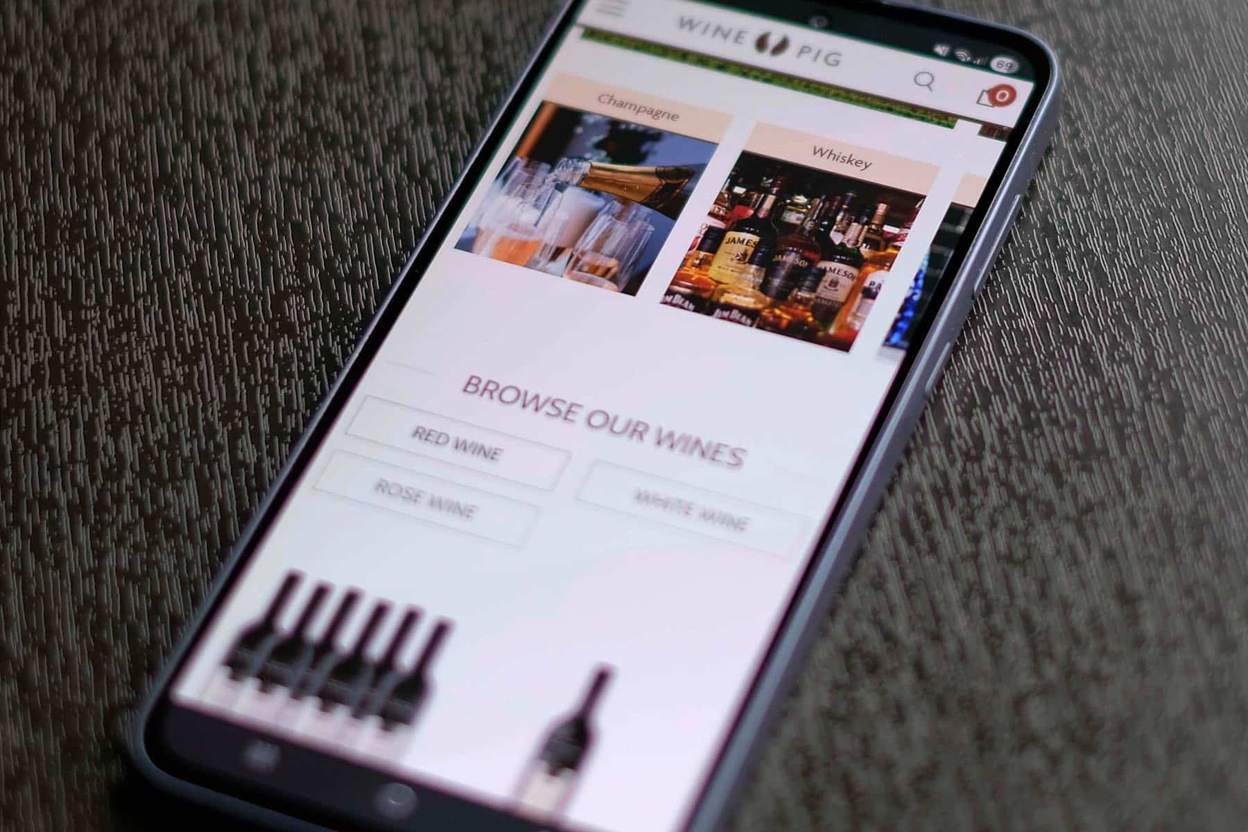
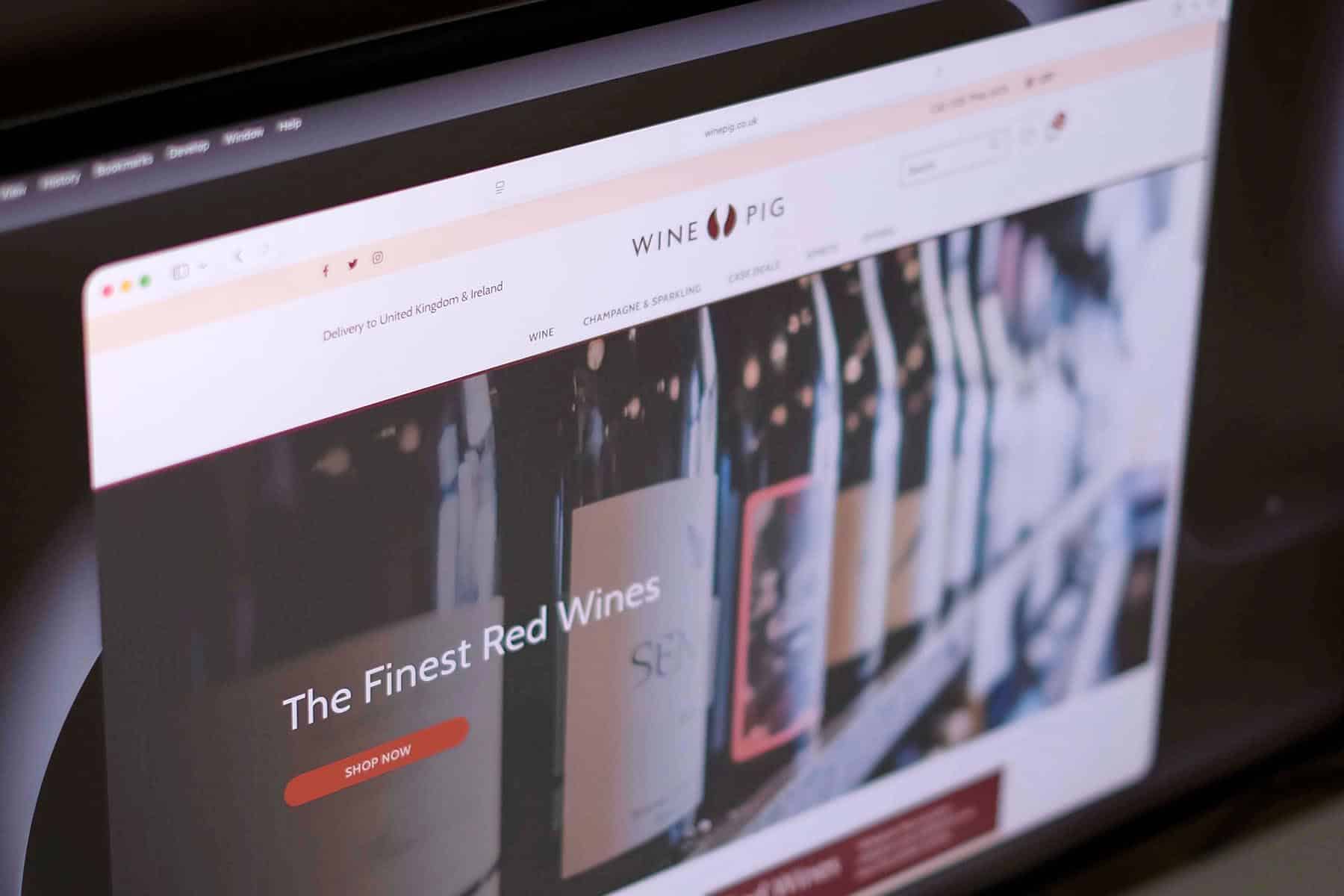
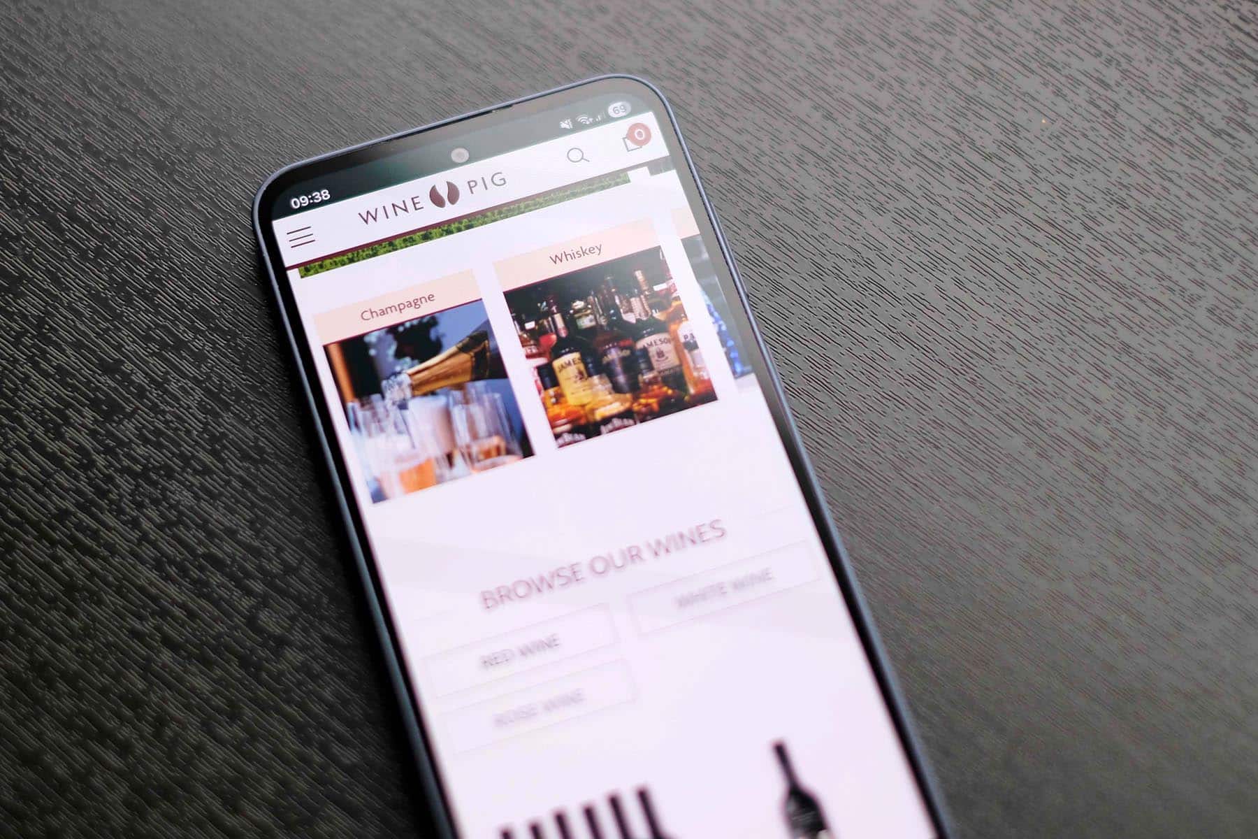
The ecommerce website design was intentionally kept clean and minimal, allowing the product photography and range of wines to take focus. Clear product categories and multiple filtering options help customers quickly find what they’re looking for, whether browsing by type, region or price.
The result is a distinctive brand and streamlined online store that reflects WinePig’s personality while providing a smooth and enjoyable shopping experience for customers across the UK and Ireland.
We use cookies to improve your experience on our site. By using our site, you consent to cookies.
Manage your cookie preferences below:
Essential cookies enable basic functions and are necessary for the proper function of the website.
Statistics cookies collect information anonymously. This information helps us understand how visitors use our website.
Google Analytics is a powerful tool that tracks and analyzes website traffic for informed marketing decisions.
Service URL: policies.google.com (opens in a new window)
You can find more information in our Redback Creations Privacy Policy and Redback Creations Privacy Policy.