Our brief was to refresh the Robinson Concrete brand and digital presence – building on the strength of their existing identity while positioning the company as a leading supplier within the industry.
Our brief was to refresh the Robinson Concrete brand and digital presence – building on the strength of their existing identity while positioning the company as a leading supplier within the industry.
The aim of the project was not to reinvent the Robinson Concrete brand, but to strengthen and modernise it. The business already had strong recognition locally, so the focus was on refining the identity to better communicate its core values of quality, service and value while ensuring the brand could work consistently across a wide range of applications.
At the same time, the new identity needed to support Robinson Concrete’s continued growth and reinforce its position within a competitive construction market.
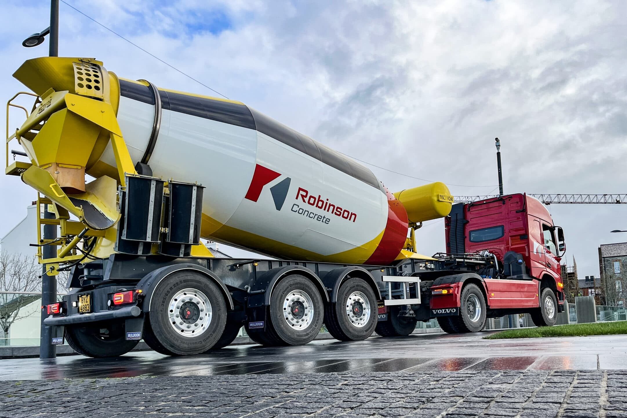
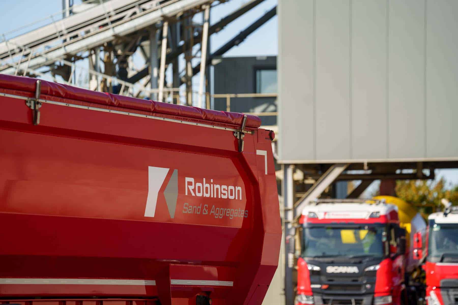
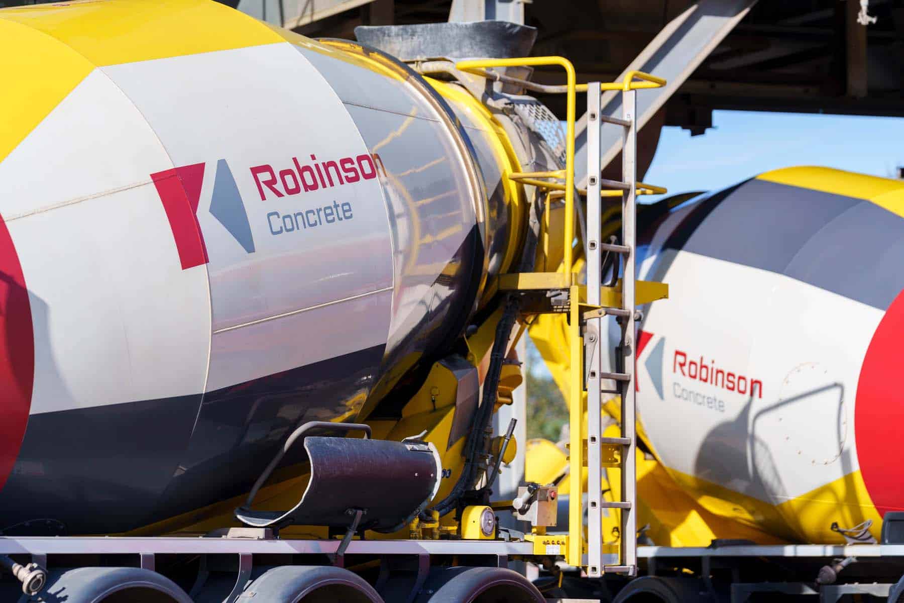
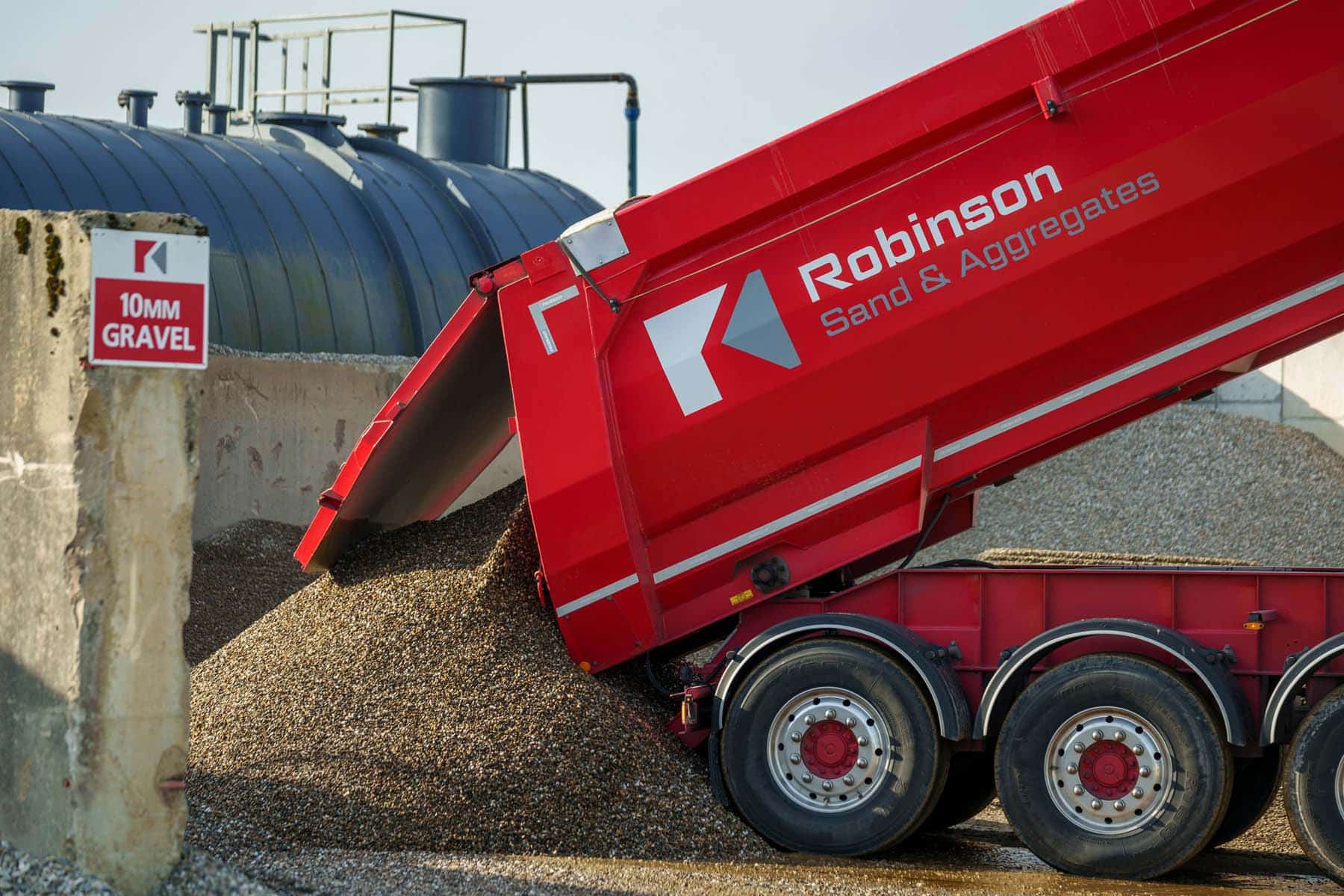
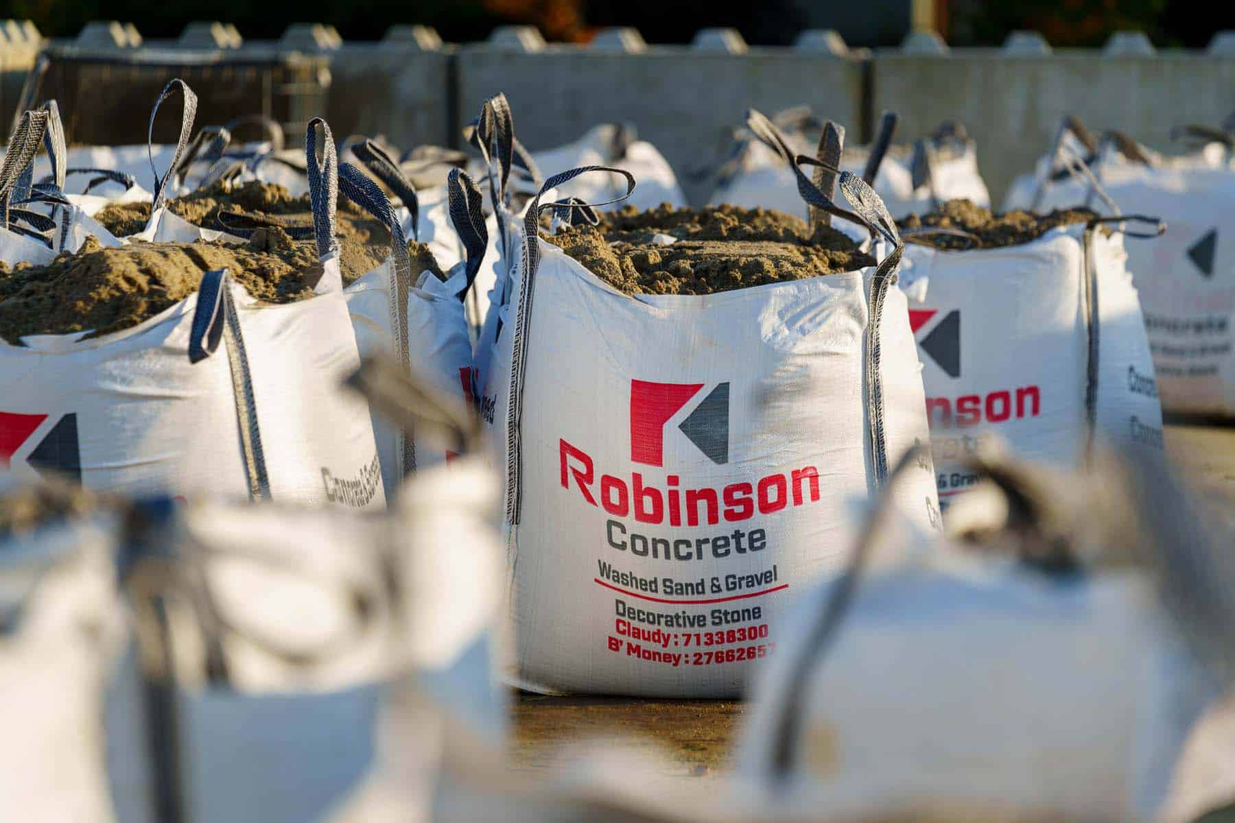
The refreshed logo was designed to feel strong, clear and dependable – qualities that closely reflect both the products and the industry itself. The icon is built from two simple geometric shapes that work together to communicate several ideas at once. It forms the initials “R” and “C” for Robinson Concrete, while also resembling a concrete block and subtly suggesting the pouring of concrete through the use of negative space.
The bold angles and consistent line widths were chosen deliberately to reflect the precision and structure associated with construction and engineering. By adapting elements of the original “R” from the previous logo, the new design also maintains a clear connection to the company’s established brand heritage.
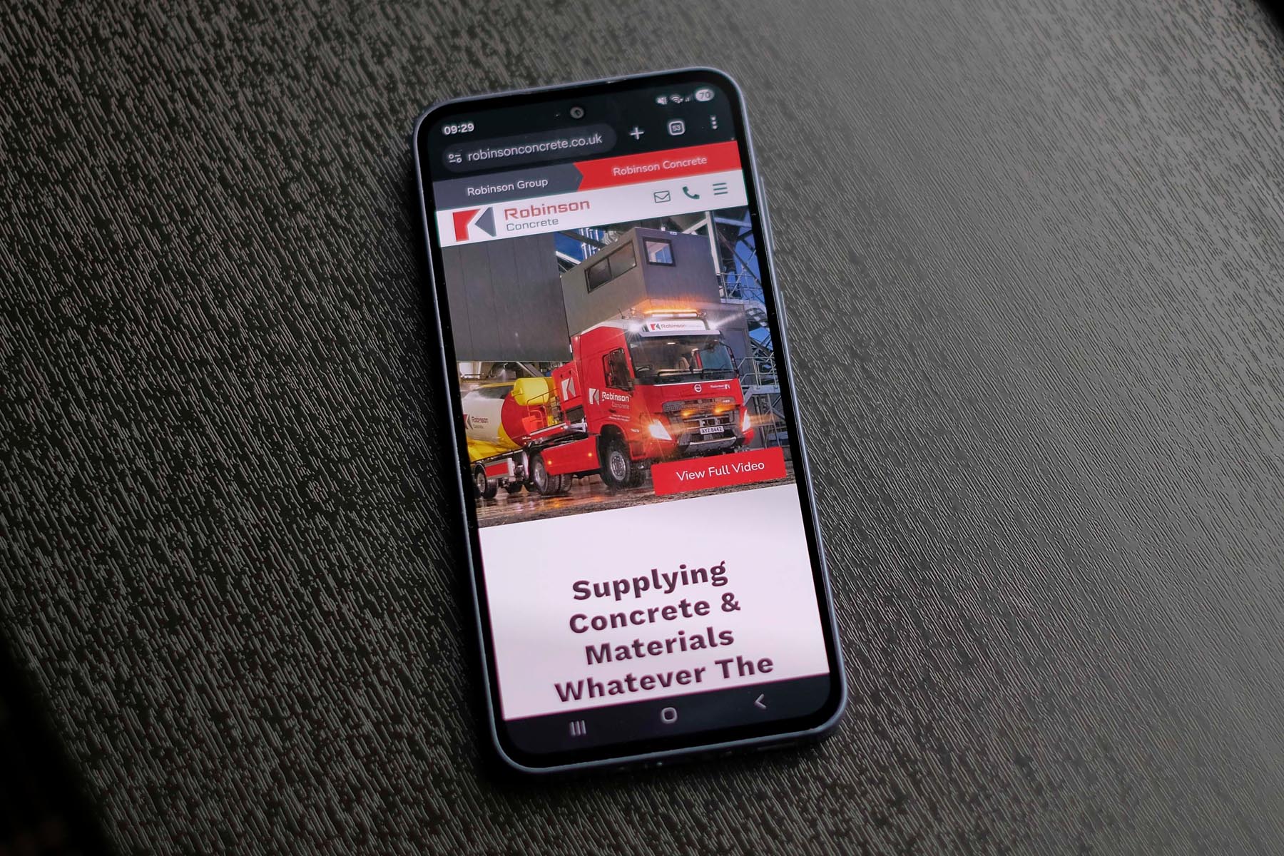
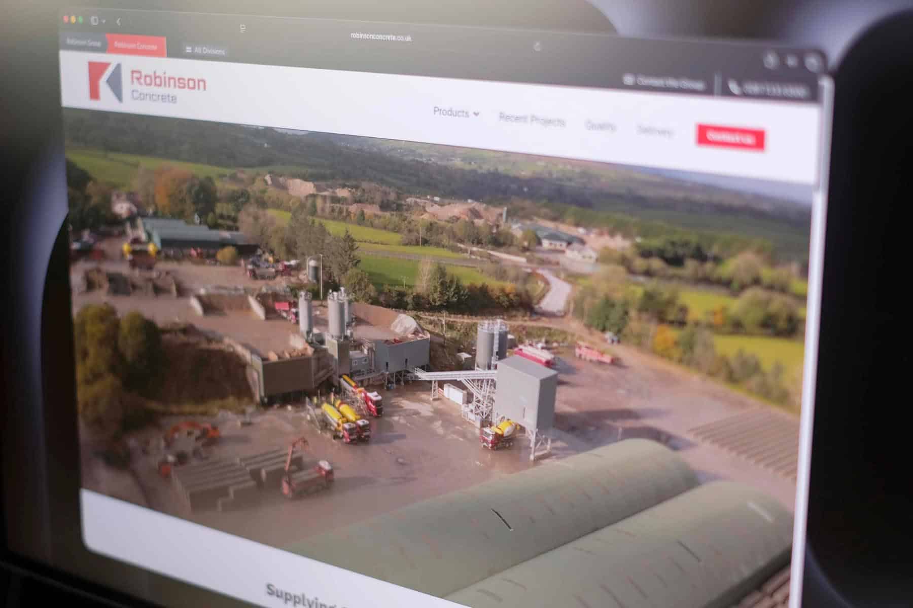
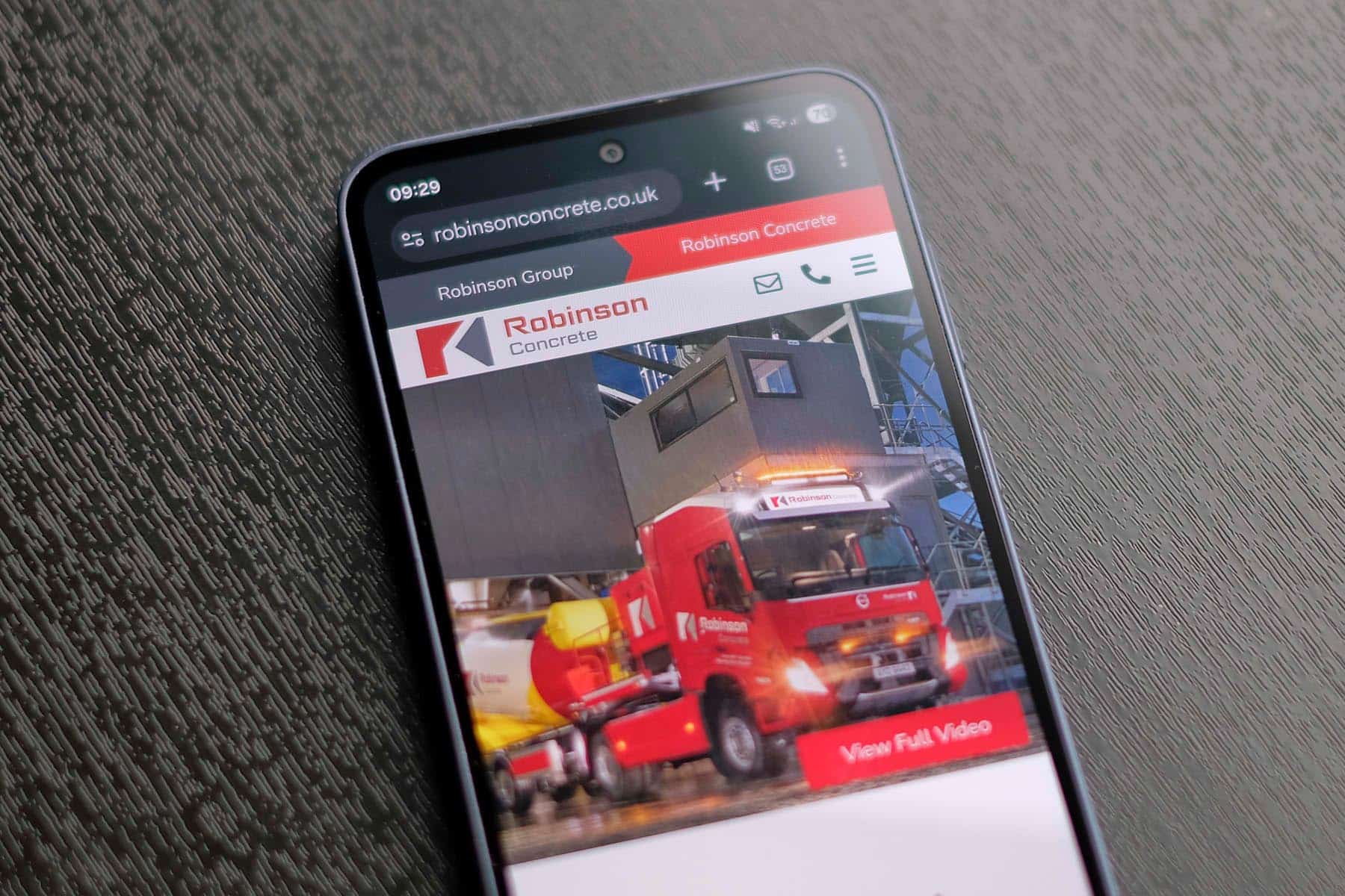
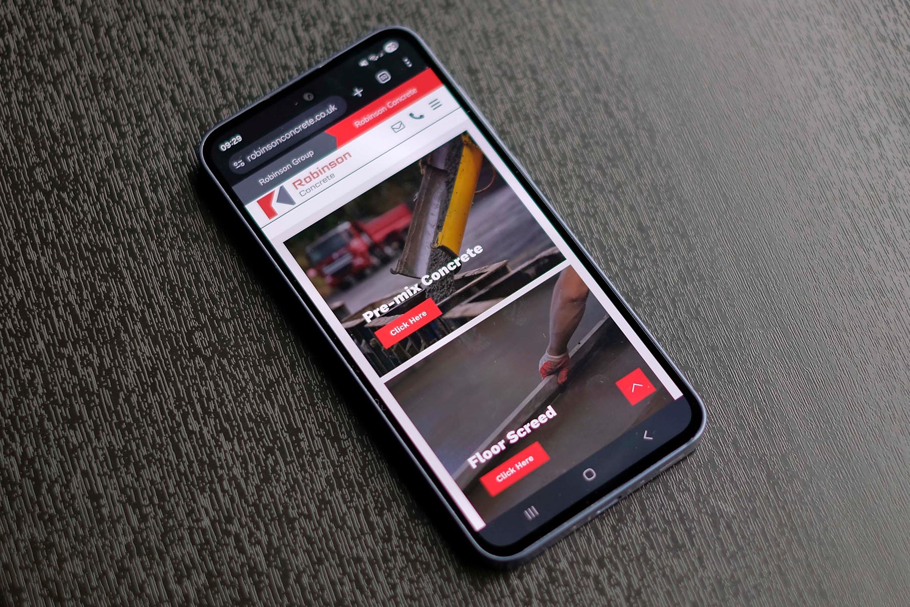
Alongside the brand update, we redesigned the Robinson Concrete website to bring the new identity to life online. The new site focuses on clear navigation, strong calls to action and a straightforward structure that allows visitors to quickly find the information they need. Fully responsive across all devices, the design reflects the professionalism and reliability the company is known for.
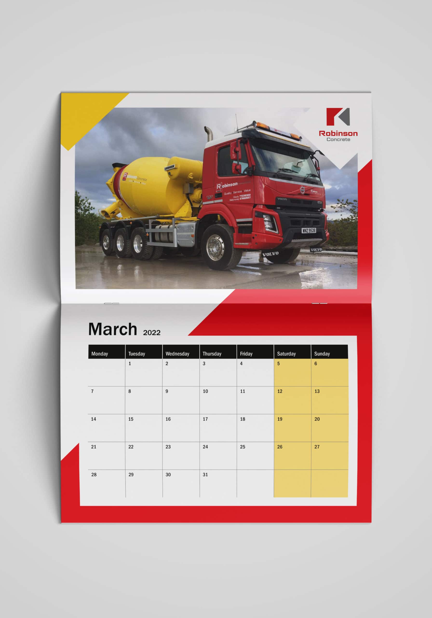
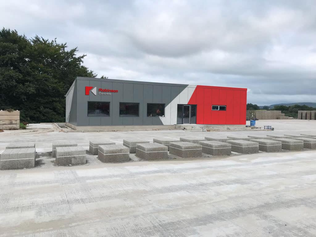
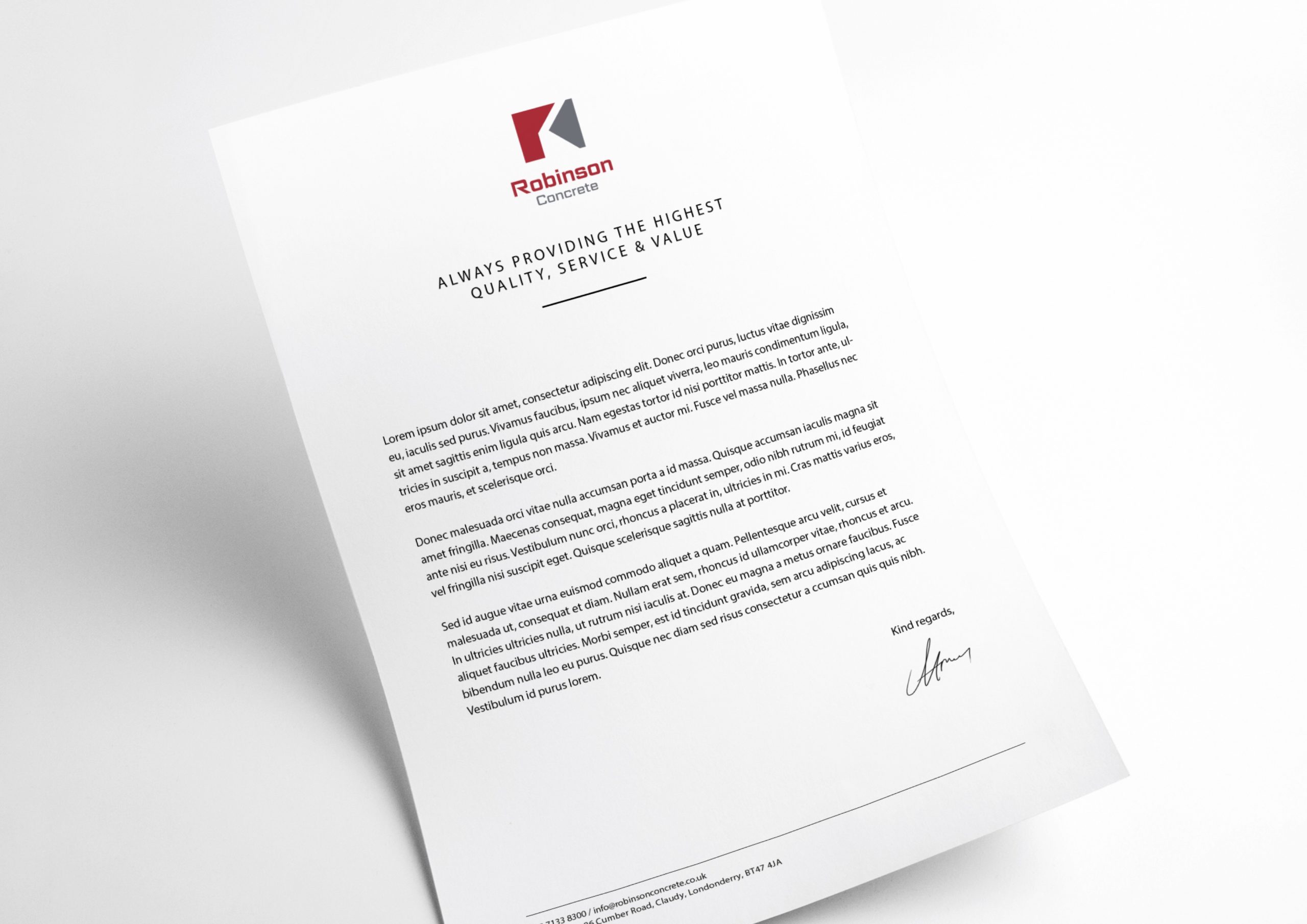
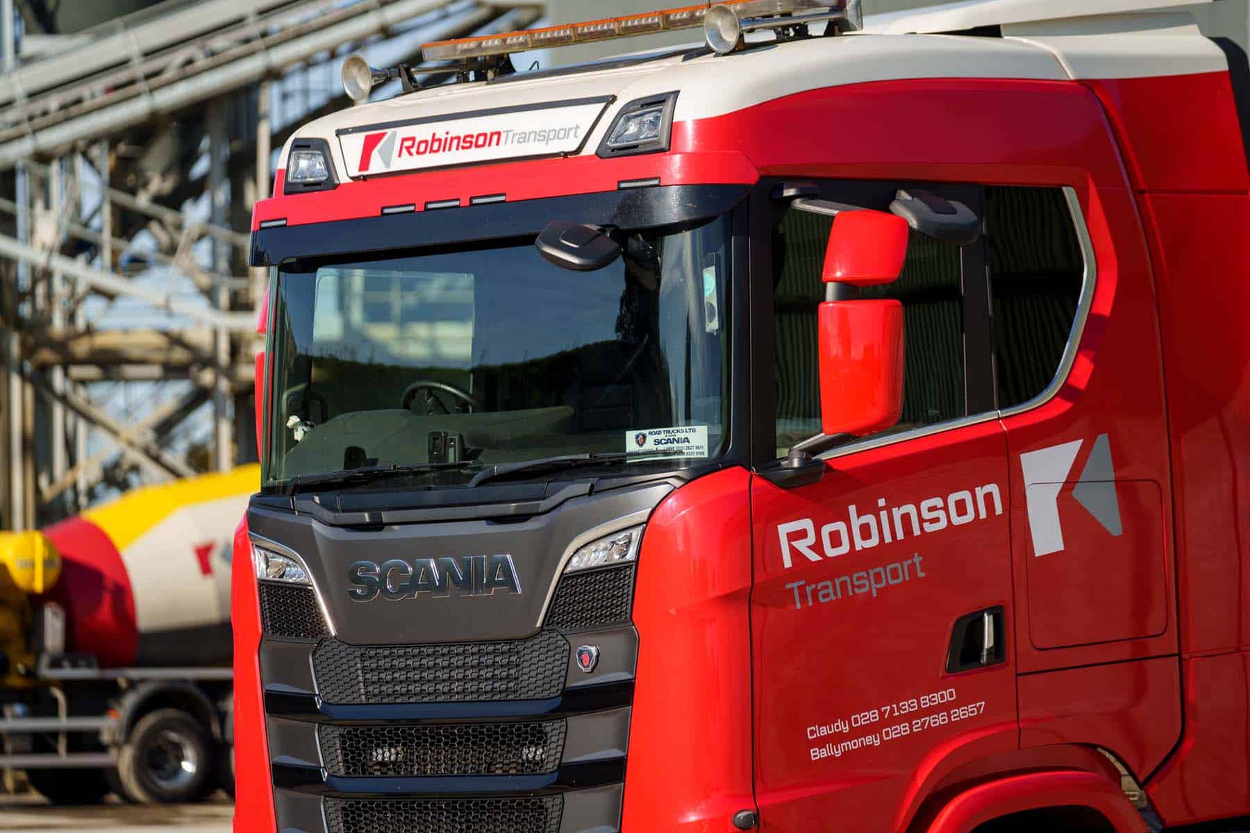
Beyond the core branding and website work, we have continued to support Robinson Concrete with a wide range of marketing and promotional materials. These include company calendars, vehicle graphics for mixer trucks, building signage, flyers and business stationery – ensuring the brand remains consistent across every touchpoint.
Our work with the business has since expanded to include the development of the wider Robinson Group umbrella brand. This has helped position the company as a broader construction and materials partner, bringing together multiple services under a single, cohesive identity for builders, architects and contractors across Ireland.
We use cookies to improve your experience on our site. By using our site, you consent to cookies.
Manage your cookie preferences below:
Essential cookies enable basic functions and are necessary for the proper function of the website.
Statistics cookies collect information anonymously. This information helps us understand how visitors use our website.
Google Analytics is a powerful tool that tracks and analyzes website traffic for informed marketing decisions.
Service URL: policies.google.com (opens in a new window)
You can find more information in our Redback Creations Privacy Policy and Redback Creations Privacy Policy.