
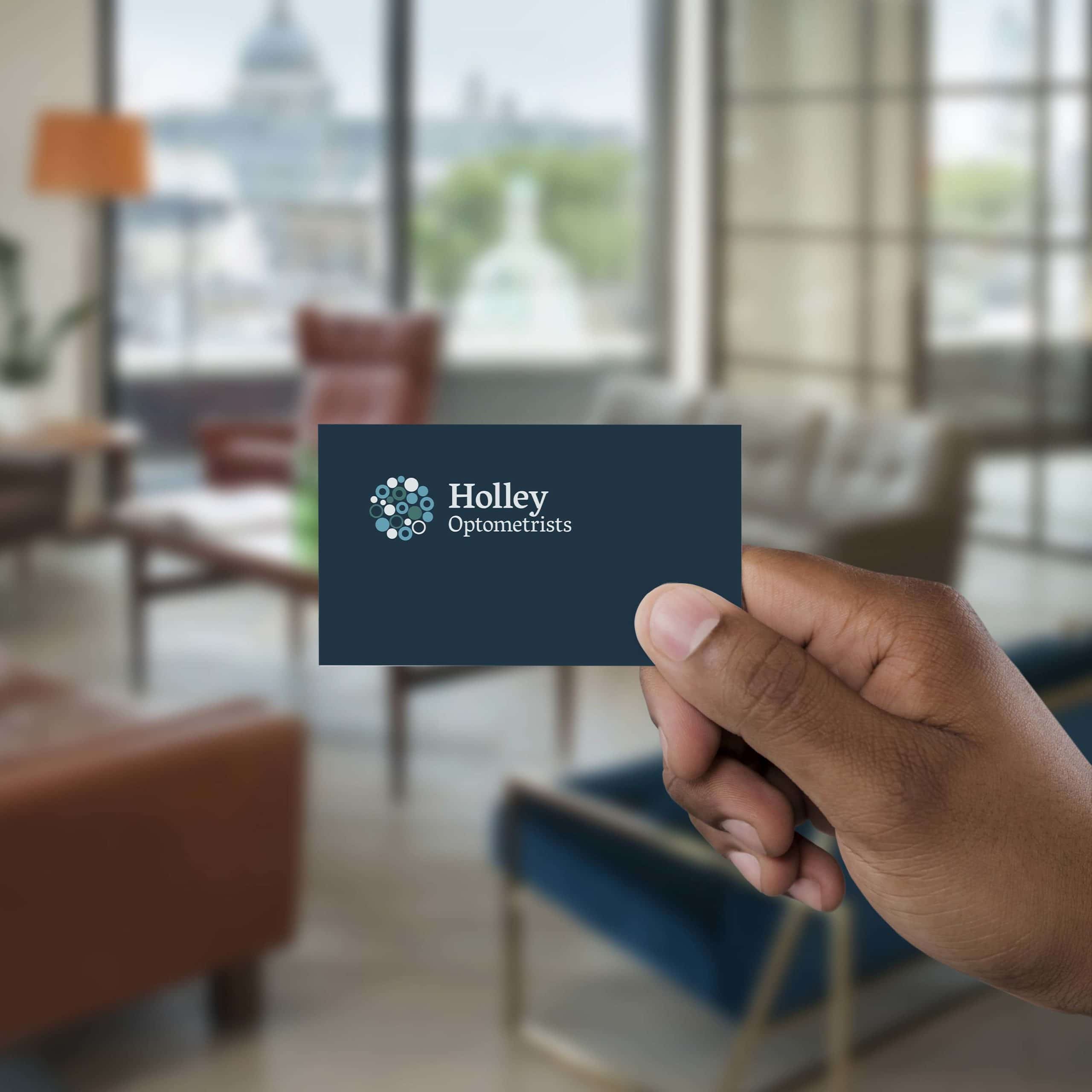
Work with Holley’s initally looked at updating their logo – simplifying the design, and refining the colours to make it more flexible for online nad print use. The newly chosen font adds a touch of sophistication, boosting the brand’s memorability and reputation for quality.
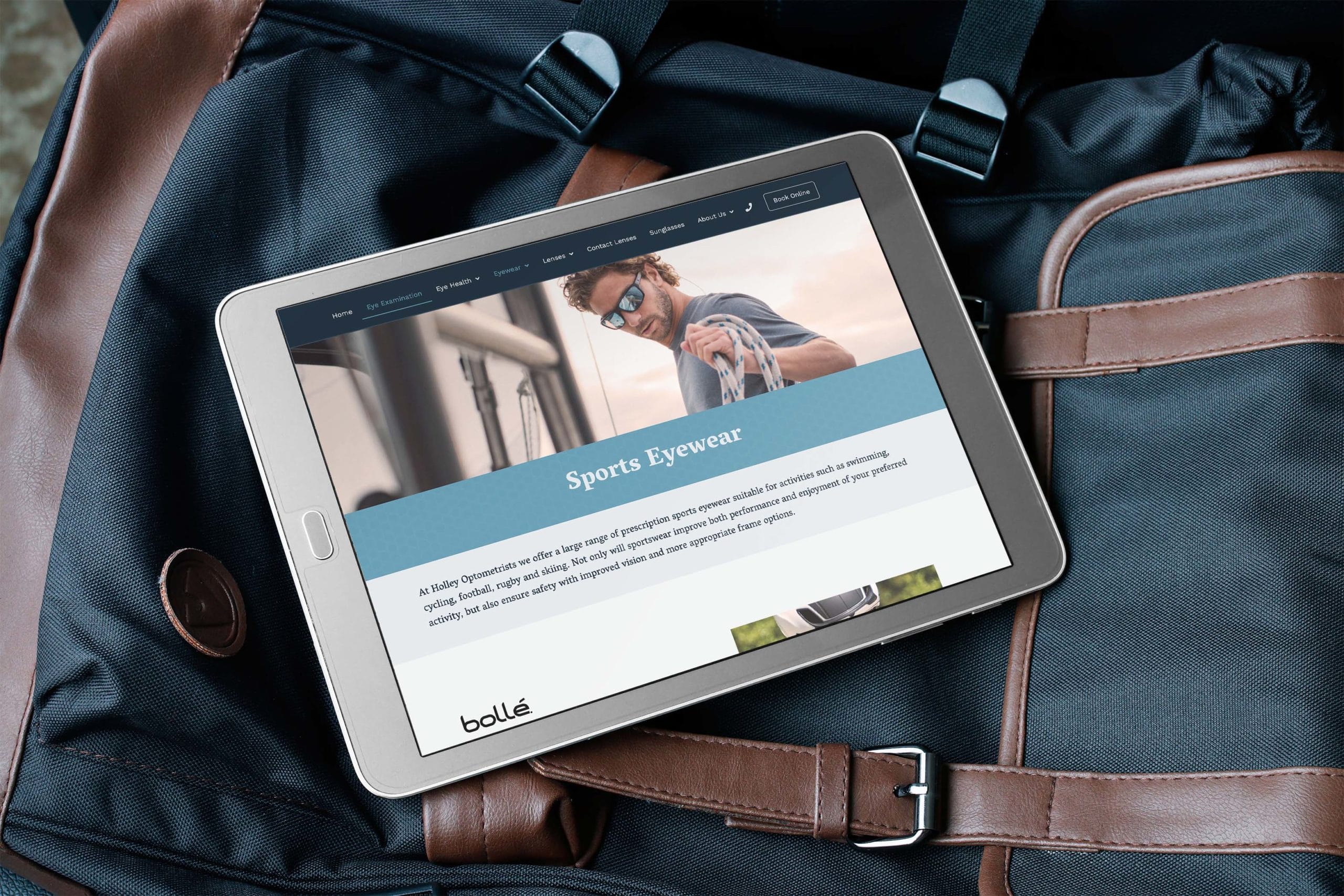
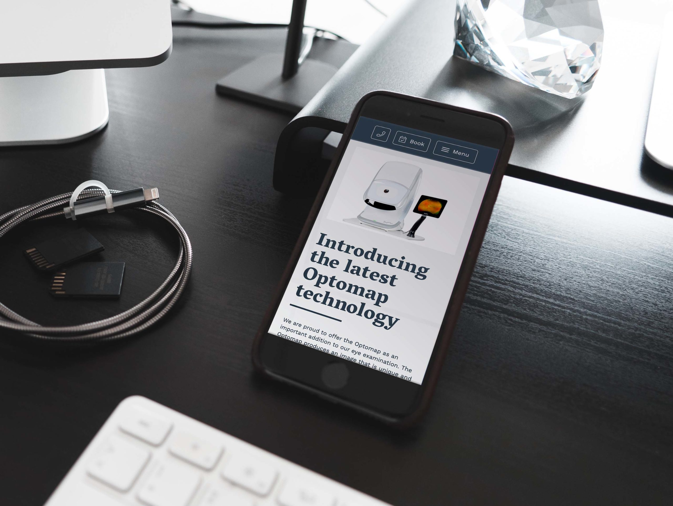
For the website, we avoided anything too clinical or sterile. Instead, we used warm tones and calming blues to create a welcoming feel. WE also made a conscious effort to avoid typical stock photography that feels fake and unpersonalised – instead using photos with lifestyle imagery that fits the brand’s personality. We also added subtle background patterns and a unique font to give the site a premium feel, reflecting the premium service and expertise provided by the staff at Holley Optometrists.

